School Branding Blog
Building a Championship School Brand: Real Charter School Results
- Author
- Mash Bonigala · Creative Director
- Published
- November 3, 2025
Every charter school leader faces the same reality: you’re competing against traditional public schools with decades of community presence, other charter schools targeting the same families, and you need enrollment results on a limited budget. Some schools break through. This is how one did.
Henderson Collegiate, a charter school in Henderson, North Carolina, had built an impressive track record. Strong academics, competitive athletics, solid college acceptance rates. The students were performing. The brand wasn’t.
Related: charter school branding | mascot logo design | visual identity design
The problem
Different programs were running different visual identities. Academic departments had their own logos. Athletic teams had separate uniform designs. The band program operated with entirely different branding. Social media channels had no visual consistency. The result: prospective families couldn’t tell what made the school unique, the community didn’t associate the school with the excellence it was delivering, students lacked strong connection to the school identity, and athletic events didn’t project the professionalism the performance deserved.
The leadership recognized the gap: their brand wasn’t matching their excellence. They needed a system that would unify athletics and academics under one identity.
Strategy before design
We started with discovery, not design. Stakeholder interviews with board members, administrators, and teachers. Student focus groups across grade levels. Parent surveys. Community input sessions. Competitive analysis of other charter and traditional schools in the region.
Several themes kept surfacing. Pride (not arrogance, but authentic pride in achievement, community, and transformation). Strength and dignity. A strong desire for unity between academic and athletic programs. And aspiration: the brand needed to project the excellence the school delivered while inspiring students to reach higher.
Why the lion
Based on those themes, the lion was the clear choice. Lions live in prides, making it a natural fit for the “Pride” concept central to the school’s identity. The lion carries universal associations with strength, dignity, leadership, and fierce protection of community. Practically, it was distinct from the mascots at neighboring schools (wildcats, bulldogs, eagles), worked across all age groups, and offered rich visual territory for both academic and athletic applications. The psychology behind mascot selection and mascot design psychology informed the approach.
The design system
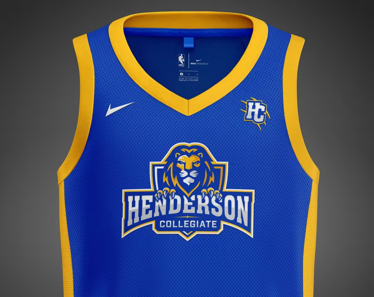
The lion was designed facing directly forward with a confident, determined expression rather than the aggressive profile pose common in school mascots. This communicates engagement and confidence without aggression. The bold mane treatment creates instant recognition at any size, from business cards to building signage. A shield framework adds institutional credibility and provides a natural container for the school name.
Royal blue and gold were chosen strategically: blue for trust, stability, and academic rigor; gold for distinction, energy, and championship aspiration. The combination photographs well, reproduces consistently, and creates high contrast across all applications. Color psychology research backed every choice.
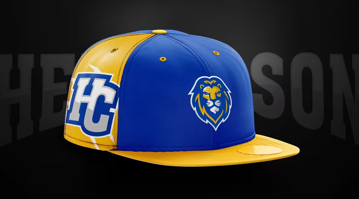
The full system includes: primary athletic logo with school name, simplified lion head for small applications, HC monogram for alternate uses, vertical and horizontal lockups, single-color versions, a bold typography system, repeating patterns (“Run with the Pride”), and sport-agnostic templates that athletics staff can customize without design expertise.
The basketball court
One of the most powerful applications was the custom basketball court design. The full lion mark at center court creates an immediate focal point. Bold “HENDERSON COLLEGIATE” lettering along the baseline gives maximum visibility to spectators and broadcasts. “PRIDE” along the sidelines reinforces the brand concept and gives the student section something to chant. Royal blue key areas with gold accents stand out from the sea of traditional wood-tone courts.
The court became more than a playing surface. It became a recruitment tool (prospective families touring the facility see the commitment to excellence immediately), a pride trigger for athletes, a community gathering symbol, and a social media backdrop that showcases professional presentation in every photo and video shared from games.

Program-specific branding
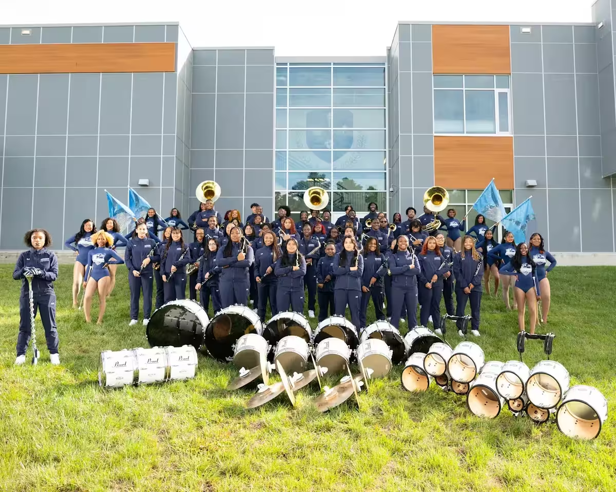
The band program needed its own identity within the system. Rather than forcing generic athletic branding on performing arts, we created “Pride of Sound” as a sub-brand: same royal blue and gold palette, same typography system, same professional standards, but with musical elements integrated and a distinct visual treatment appropriate for performing arts contexts.
This matters because programs embrace branding that honors their uniqueness. Forcing a one-size-fits-all approach creates resistance. Allowing program-specific variations within a unified system creates adoption and pride. This is the same principle behind district branding approaches for multi-school systems.
Digital and environmental execution
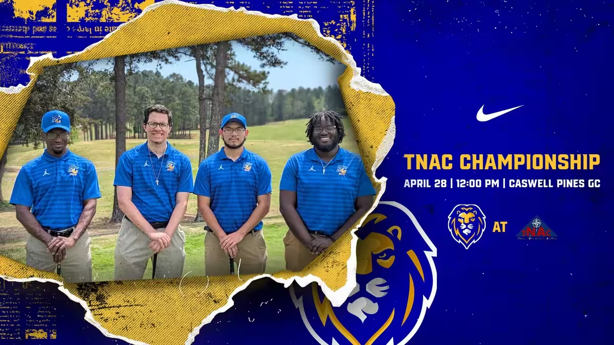
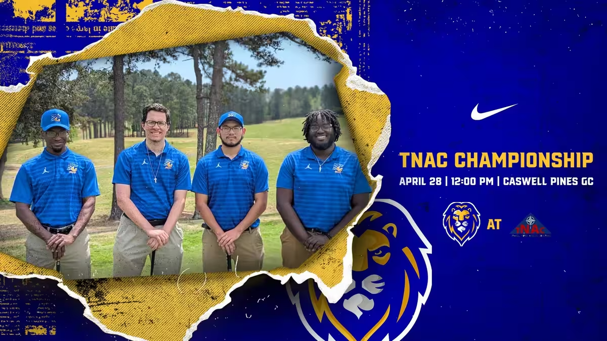
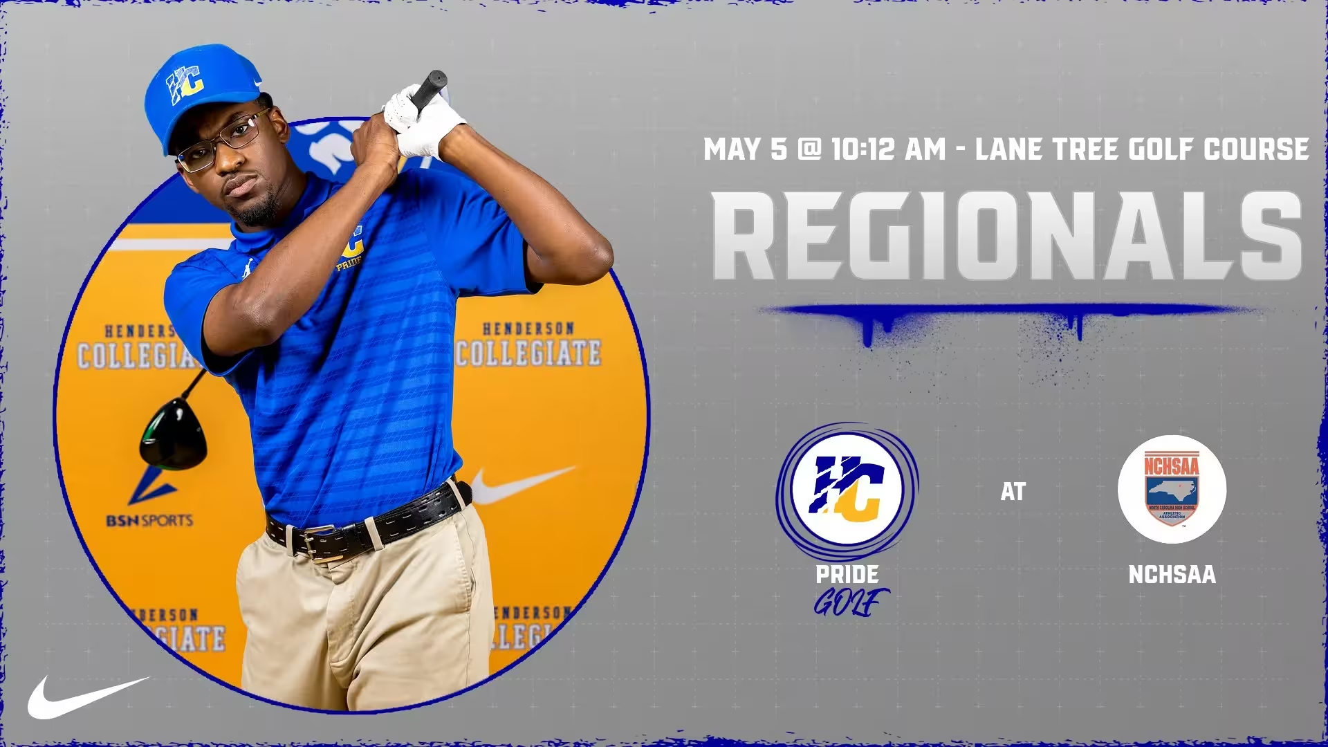
Social media templates were built to be sport-agnostic: game announcements, score updates, player spotlights, achievement celebrations, event promotions. All designed for non-designers to use, with clear guidance on photo cropping, pre-set text positions, and consistent visual elements (torn-paper photo frames, bold typography treatments, school color backgrounds). Every post reinforces the school’s commitment to excellence.
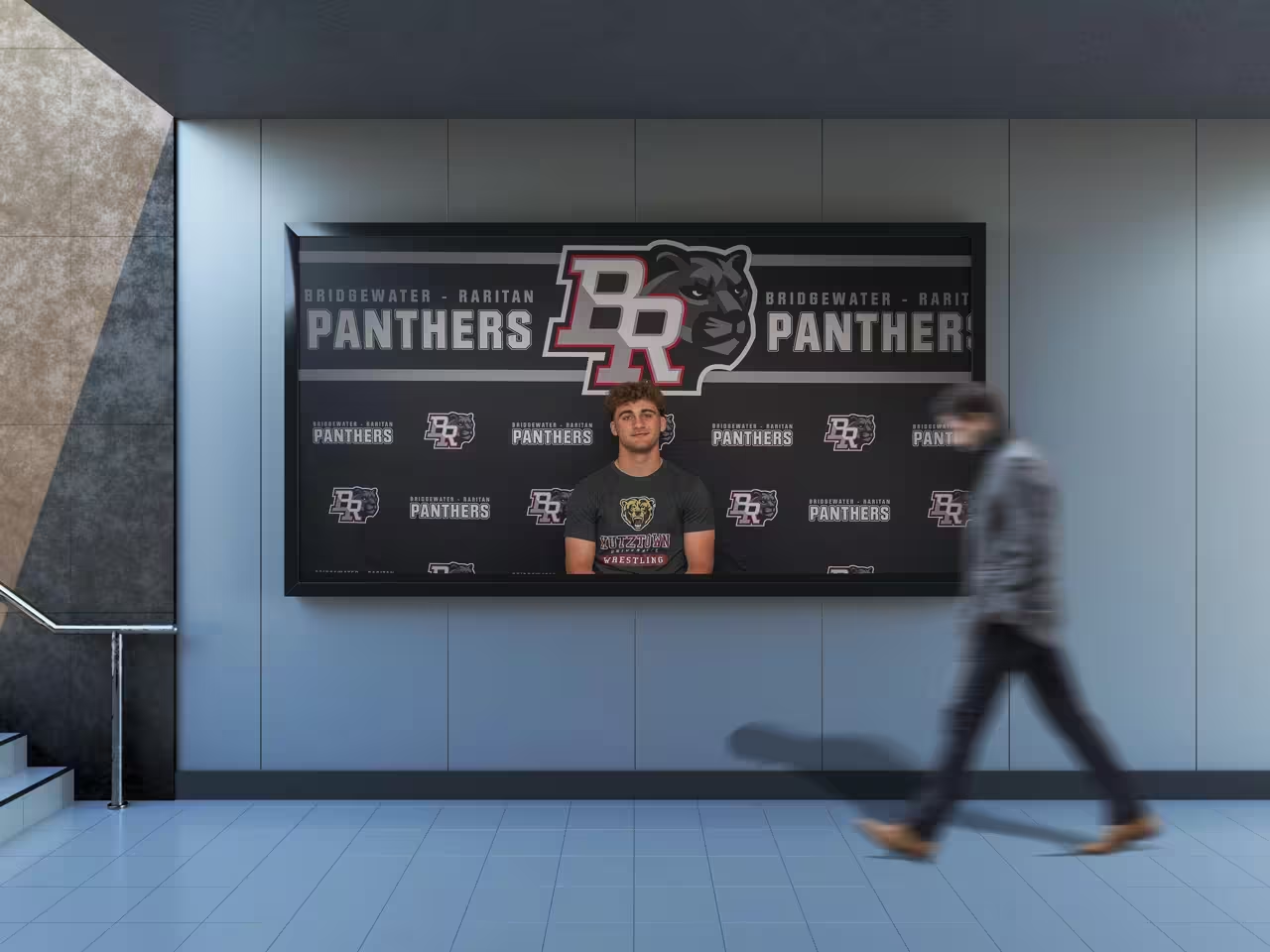
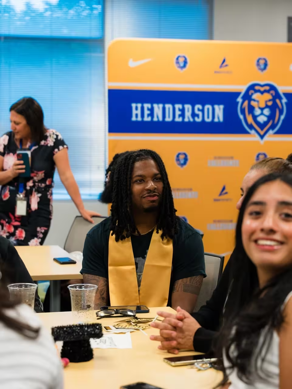
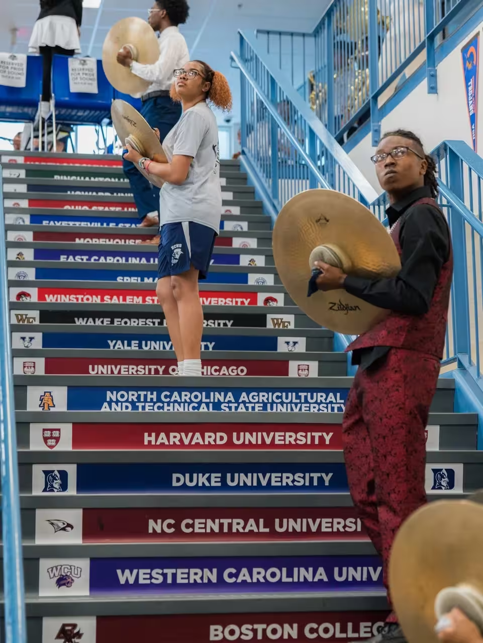
Campus environment transformed through modular media backdrop panels for events and signings, wayfinding and signage updates, branded trophy and recognition displays, and the powerful staircase installation featuring university logos of college acceptances.
The rollout
The launch was sequenced for momentum. Athletics first: the basketball court reveal created immediate visual impact, new uniforms turned athletes into brand ambassadors, and social media channels adopted new branding simultaneously. Then environmental rollout: gymnasium wall graphics, media backdrops, campus signage. Then program expansion: “Pride of Sound” band identity, academic material templates, student store merchandise. Finally a community celebration tying it all together.
This phased approach follows the first 100 days launch strategy that maximizes adoption and community buy-in.
The results
Enrollment applications increased following the rebrand. Enrollment marketing costs decreased as stronger brand recognition reduced reliance on paid advertising. Yield rates improved (higher percentage of accepted students chose to enroll). Athletic participation grew. Merchandise sales grew significantly. Social media channels saw dramatic follower and engagement increases. Student pride and connection to school identity increased in surveys.
Community recognition shifted: the lion became immediately identifiable as Henderson Collegiate’s symbol throughout the region. What had been an academically strong school with no visual identity became an academically strong school that looked and felt like one.
The full portfolio case study includes additional visual examples and project details.
What this means for other charter schools
The transformation from fragmented to unified, from invisible to recognizable, from good school to championship brand, followed principles that apply to charter schools at any stage.
Build the strategy on authentic values. Think in systems, not logos. Execute with professional quality that matches the excellence you deliver. Roll out with intention that builds momentum. And treat the brand as an ongoing investment, not a one-time project.
For charter schools in the application or launch phase, our charter application branding service covers the specific needs of pre-approval branding. For established charter schools ready to elevate, charter school branding services apply the approach documented here.
Where to start
- Run a brand audit
- Explore charter school branding
- See the full Henderson Collegiate case study
- See what we’ve done for 250+ schools
- Talk to us
More on this topic: Charter School Launch Branding Checklist | Unify Athletic and Academic Branding | Mascot Design Psychology | School Branding That Drives Enrollment
We Build and Manufacture Mascot Costumes
A professionally built mascot costume creates unforgettable moments at games, rallies, and community events.

See Full Details →
Design to Delivery
We manage everything
6-12 Week Delivery
In time for your season
Safety First
Ventilation & visibility
Custom Projects
Professional quality
Charter School Branding - Mascots & Identity (2025)
Launch a charter brand that fills seats
We help charter schools build mascots and identity systems that rally communities and support enrollment. See packages and proof.
Get Charter Pricing →Related
Charter School Branding - Mascots & Identity (2025)
We help charter schools build mascots and identity systems that rally communities and support enrollment. See packages and proof.
View detailsRelated
Charter Application Branding - Professional Identity for Authorizer Approval
Professional charter application branding that demonstrates operational readiness to authorizers. Complete brand identity, website, and application materials. Charter-specific packages for charter schools.
View details