Client
Location
Henderson, North Carolina
Services Rendered
- Primary mascot design and character development
- Complete athletic branding system
- Multiple secondary marks and logo variations
- Custom typography system
- Environmental design for athletic facilities
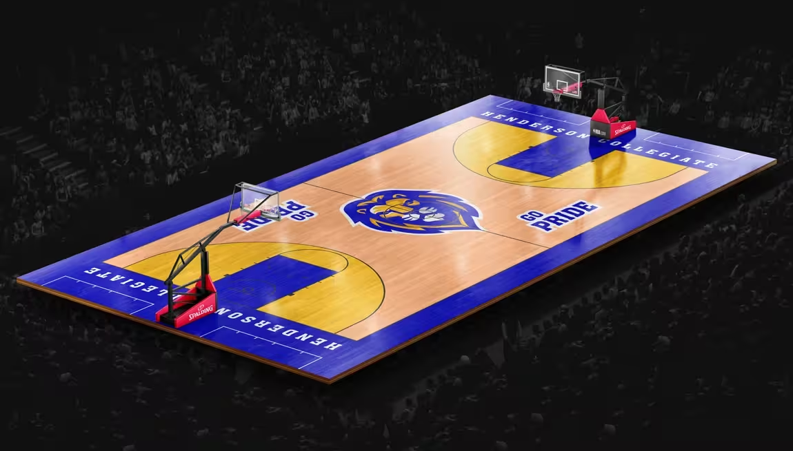
- Basketball court design and implementation
- “Pride of Sound” band program identity
- Print collateral system
- Digital asset development
- Comprehensive brand guidelines
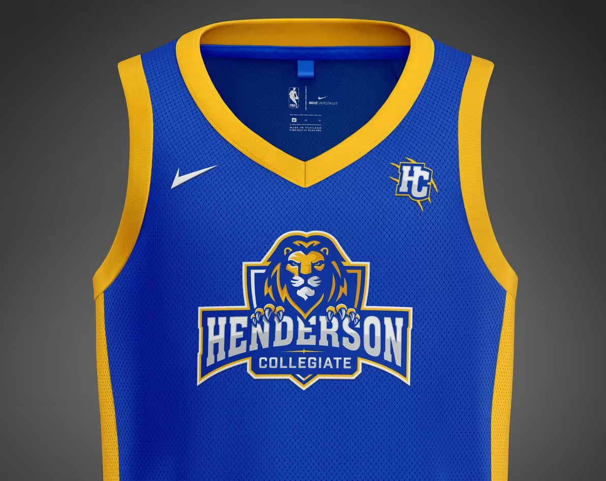
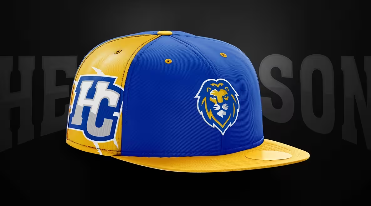
- Merchandise and uniform design
The Challenge
Henderson Collegiate, a high-performing college-preparatory charter school in Henderson, North Carolina, had built an exceptional reputation for academic excellence—but their visual identity told a different story.
The Problem: Despite serving 900+ students across grades K-11 with impressive college acceptance rates, the school was using inconsistent branding across departments. The athletic program had no unified mascot. The band program used different colors than the main school. Parents seeing the website, gymnasium, and printed materials would encounter three different visual languages.
The Impact: Athletic participation was plateauing. Spirit wear sales were minimal because students didn’t feel connected to the brand. The school’s excellence wasn’t visible to prospective families touring the campus. Leadership knew their visual identity wasn’t matching their academic reputation.
Our Task
Develop a comprehensive visual identity system that would:
- Unite academic and athletic programs under one cohesive brand
- Create a mascot that students would wear proudly
- Provide a scalable system for environmental graphics, digital media, and merchandise
- Reflect the school’s college-preparatory mission and community pride
The system needed to work across 30+ applications—from basketball courts to band uniforms to social media—while remaining distinctive in the competitive Henderson market.
Strategic Approach
Our Action Plan
Research Phase (Weeks 1-3): We conducted 23 stakeholder interviews with administrators, teachers, students, parents, and board members. We surveyed 340 students about their connection to the school. We analyzed 8 competing charter schools in the region to identify differentiation opportunities.
Key Insights Discovered:
- Pride emerged as the unifying concept—students wanted to feel proud wearing school gear
- Transformation was central to the mission (college-prep focus)
- Strength and Dignity reflected the character development approach
- Unity across programs was essential but currently missing
Design Development (Weeks 4-10): We created 6 mascot concepts, testing each with focus groups. The lion emerged as the clear winner—symbolizing pride, strength, and leadership. We refined the design through 4 major revision cycles, focusing on:
- A forward-facing, confident stance (not aggressive)
- Distinctive mane that worked at small sizes
- Shield-like crest for collegiate tradition
- Expressions that balanced strength with approachability
System Architecture (Weeks 11-16): We developed 43 distinct brand elements including:
- Primary and secondary mascot marks
- Athletic-specific variations
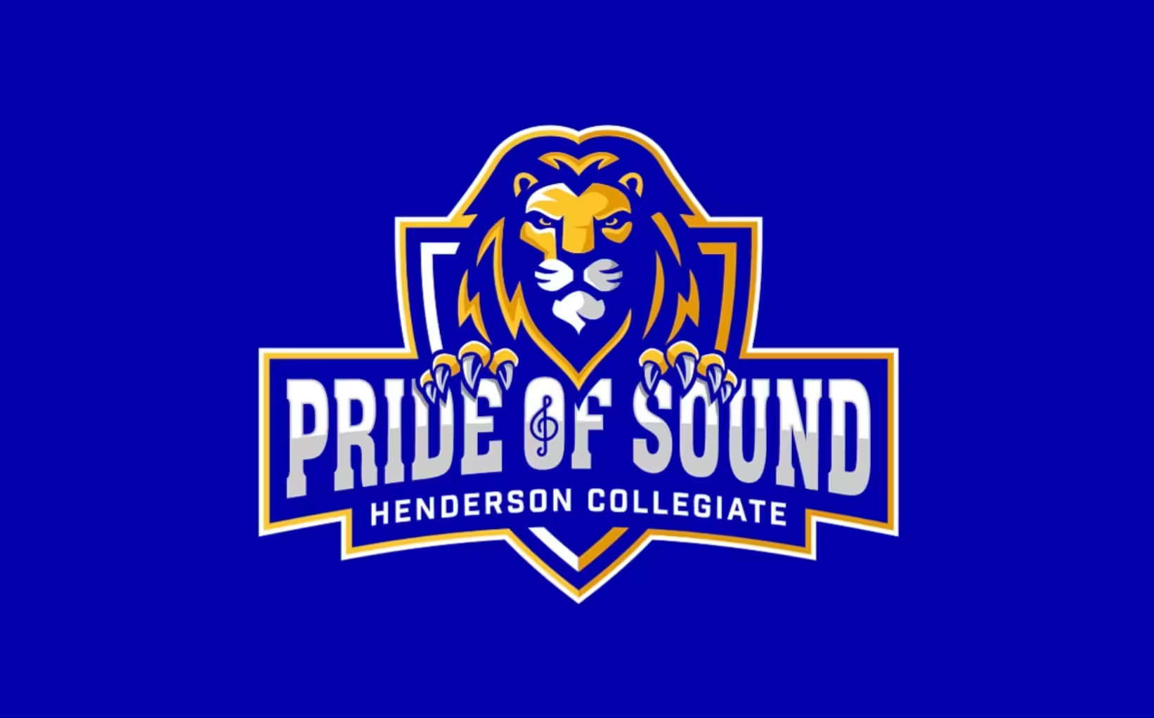
- “Pride of Sound” band sub-brand with musical integration
- Custom numerals for uniforms
- Pattern system for backgrounds
- Complete color palette with hex, CMYK, and Pantone specs
- Typography system with 3 font pairings for different contexts
- 85-page brand guidelines document
Implementation Strategy: We prioritized high-visibility applications for maximum impact:
- Basketball court design and installation (Week 1)
- Athletic uniforms for 8 sports (Weeks 2-4)
- Gymnasium environmental graphics (Weeks 5-8)
- Social media template rollout (Week 6)
- Campus signage and wayfinding (Weeks 9-12)
- Merchandise program launch (Week 8)
The phased approach ensured immediate visibility while maintaining budget control and minimizing disruption during the school year.
Read our school branding guide.
Everything you need to know to create a kick-ass school brand that creates results.
Mascot Design and Character Development
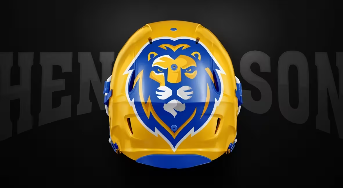
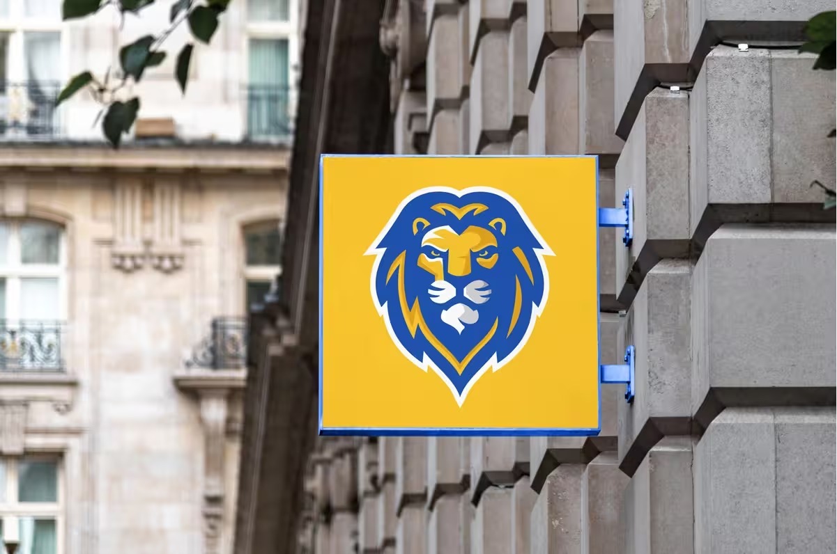
We created a forward-facing lion with a determined expression and distinctive mane, framed within a shield-like crest. The design balances collegiate tradition with contemporary styling, creating a mascot that is both timeless and relevant. The lion’s direct gaze communicates confidence, while the overall treatment projects strength and dignity.
Athletic Identity System
The athletic identity system included:
- Primary athletic logo with “Henderson Collegiate” designation
- Alternate lockups for different applications
- Sport-specific variations
- Simplified mark for small applications
- Custom numerals for uniform applications
- Consistent pattern design for backgrounds and supporting graphics
Basketball Court Design
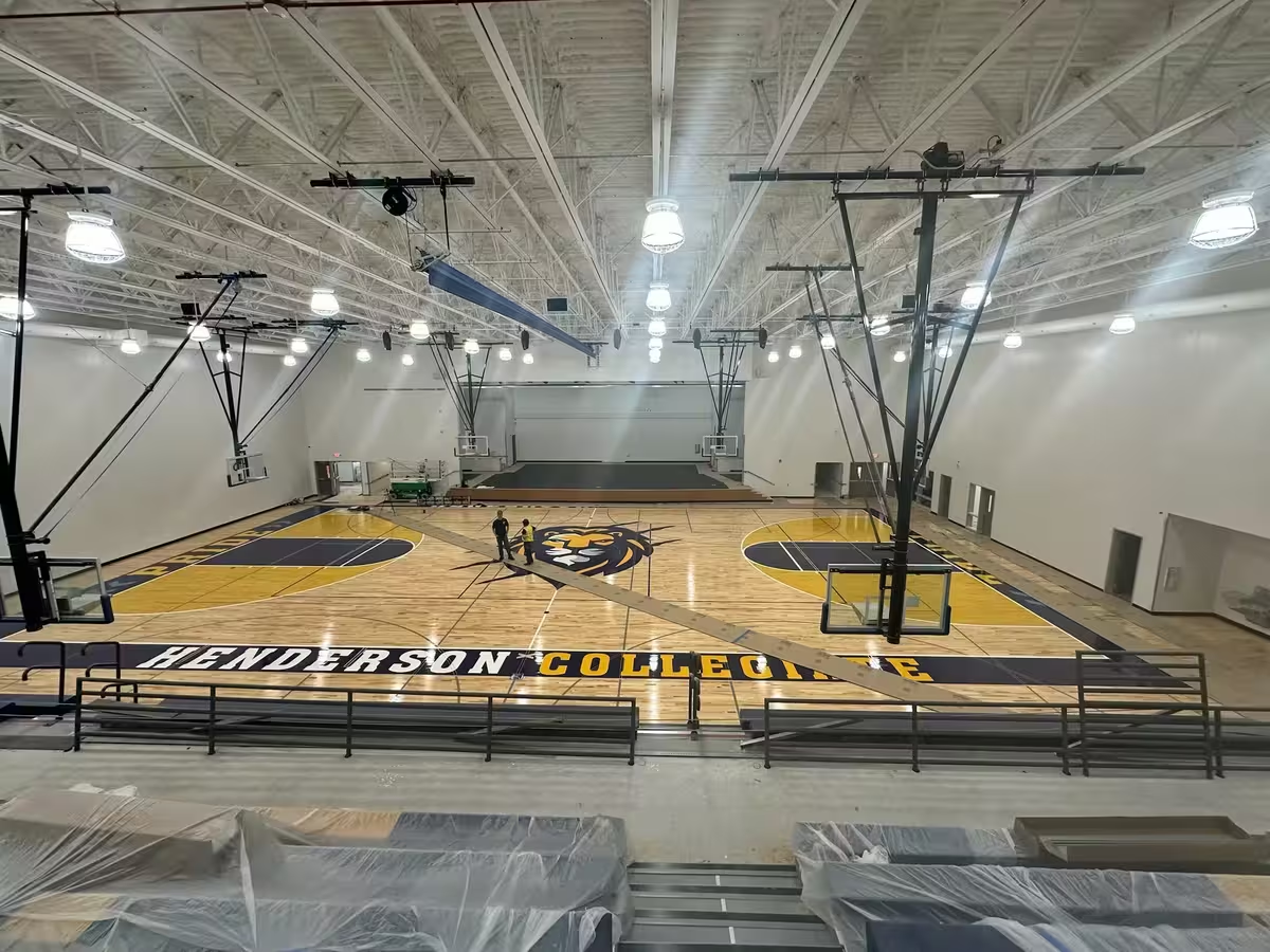
A standout component of this project was the custom basketball court design, featuring:
- Bold application of the primary Henderson Collegiate blue
- Strategic placement of the lion mascot at center court
- “HENDERSON COLLEGIATE” baseline typography
- “PRIDE” sideline designations
- Distinctive key areas with contrasting gold
- Cohesive integration of the visual identity into the playing surface
“Pride of Sound” Band Program Identity
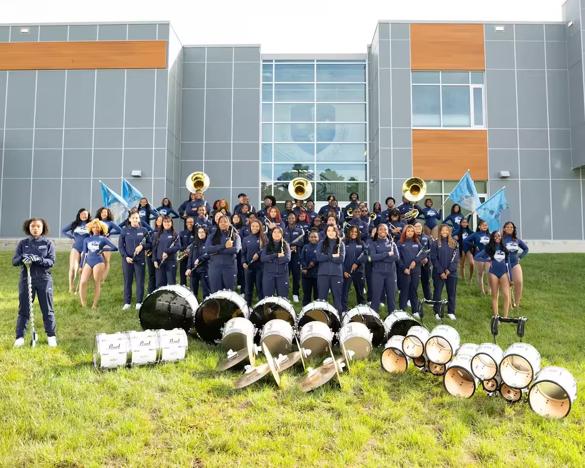
We developed a specialized variation of the lion identity for the school’s “Pride of Sound” band program, incorporating musical elements while maintaining consistency with the core brand. This sub-brand exemplifies how a thoughtful identity system can support diverse programs while maintaining brand cohesion.
Environmental Applications
The Henderson Collegiate identity was extended to various environmental applications:
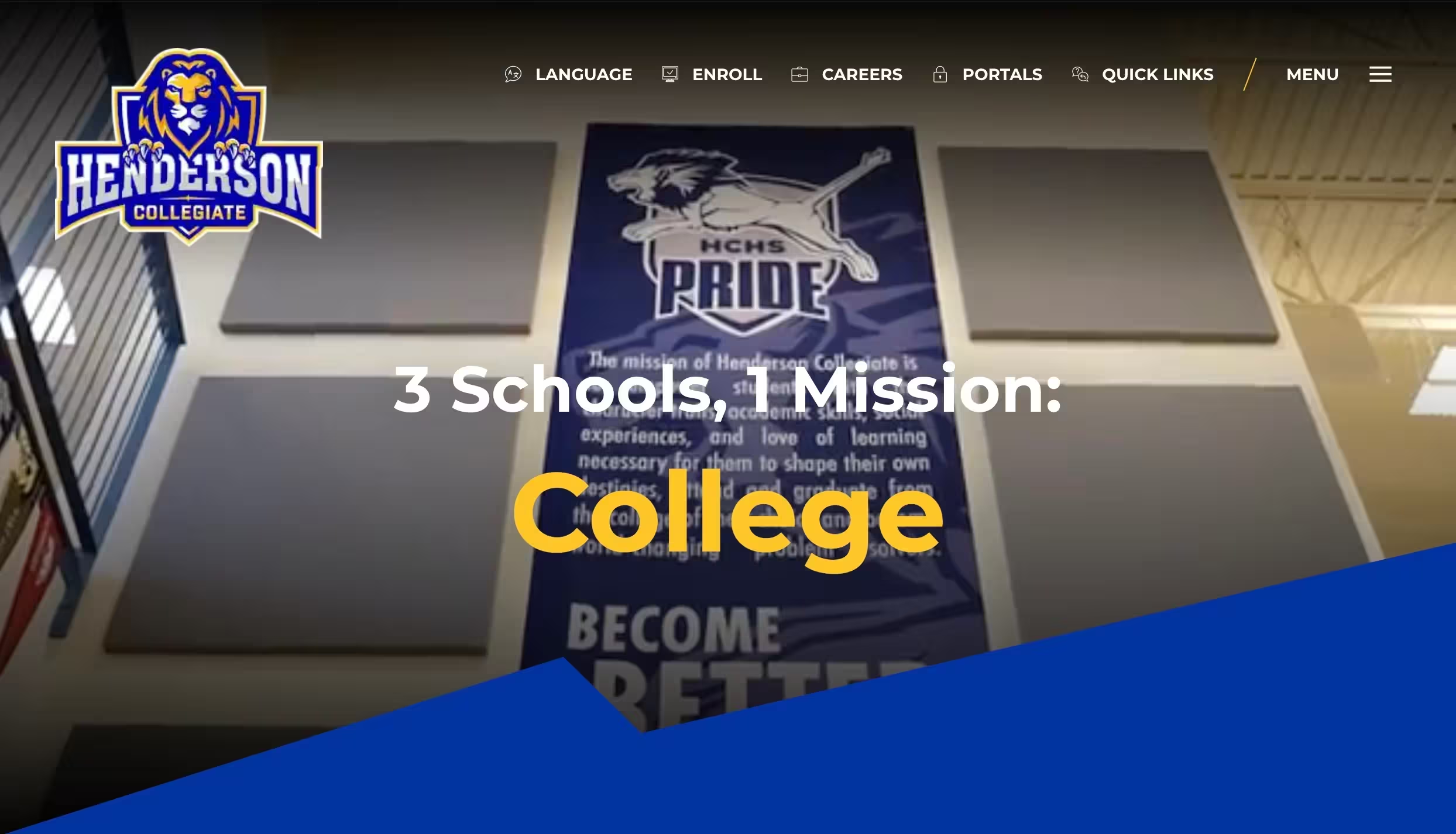
- Gymnasium wall graphics
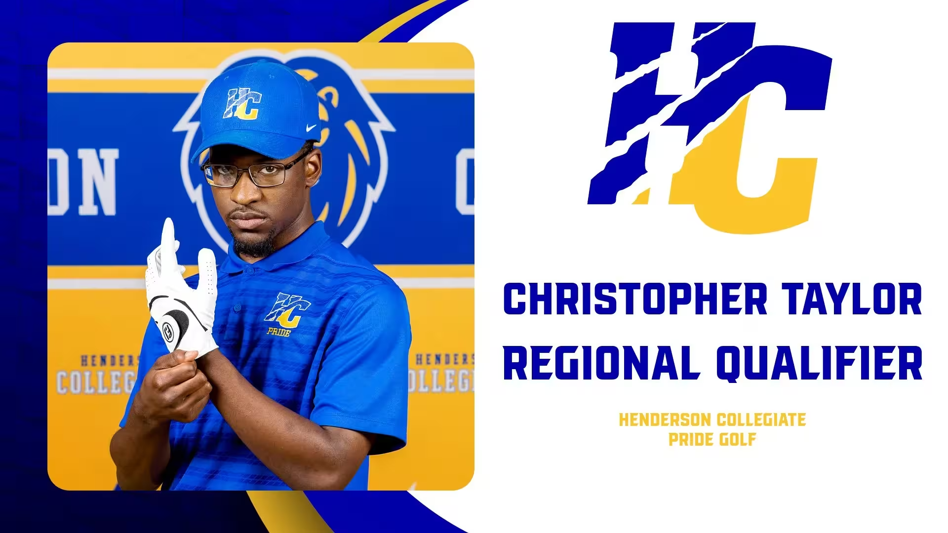
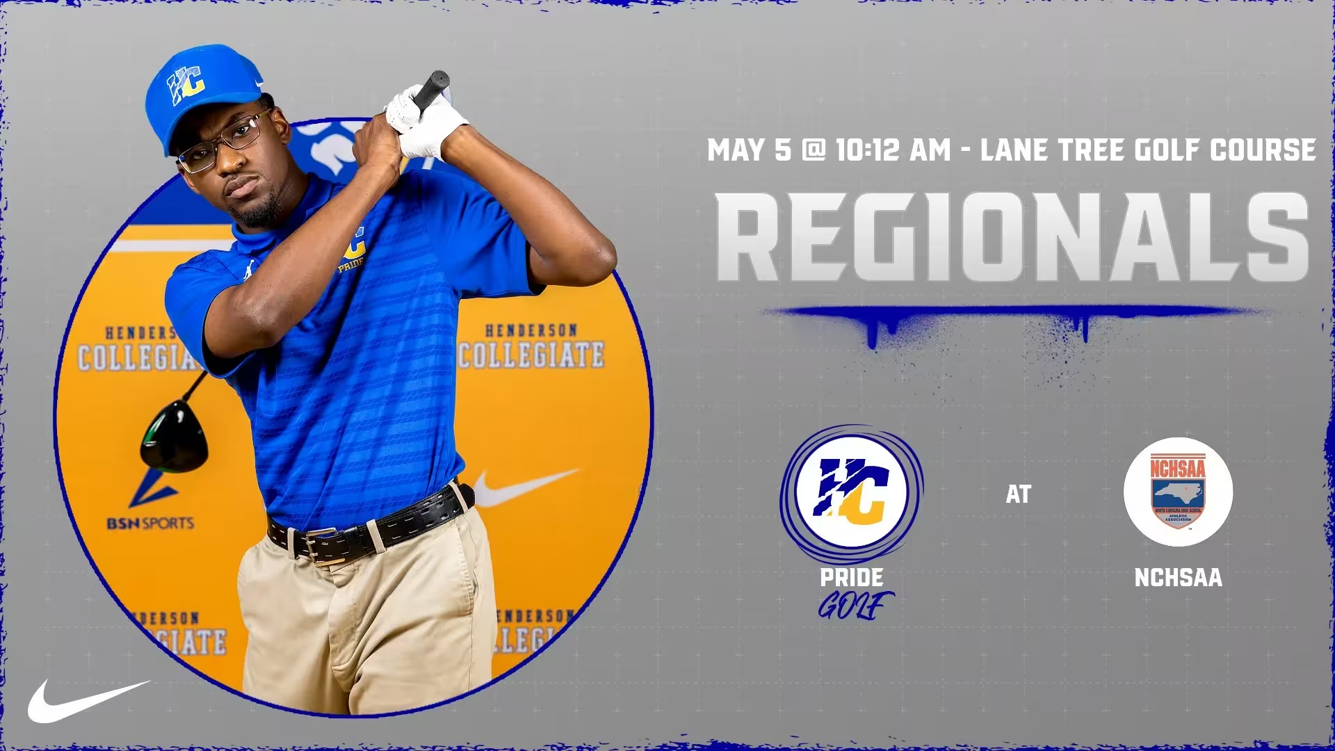
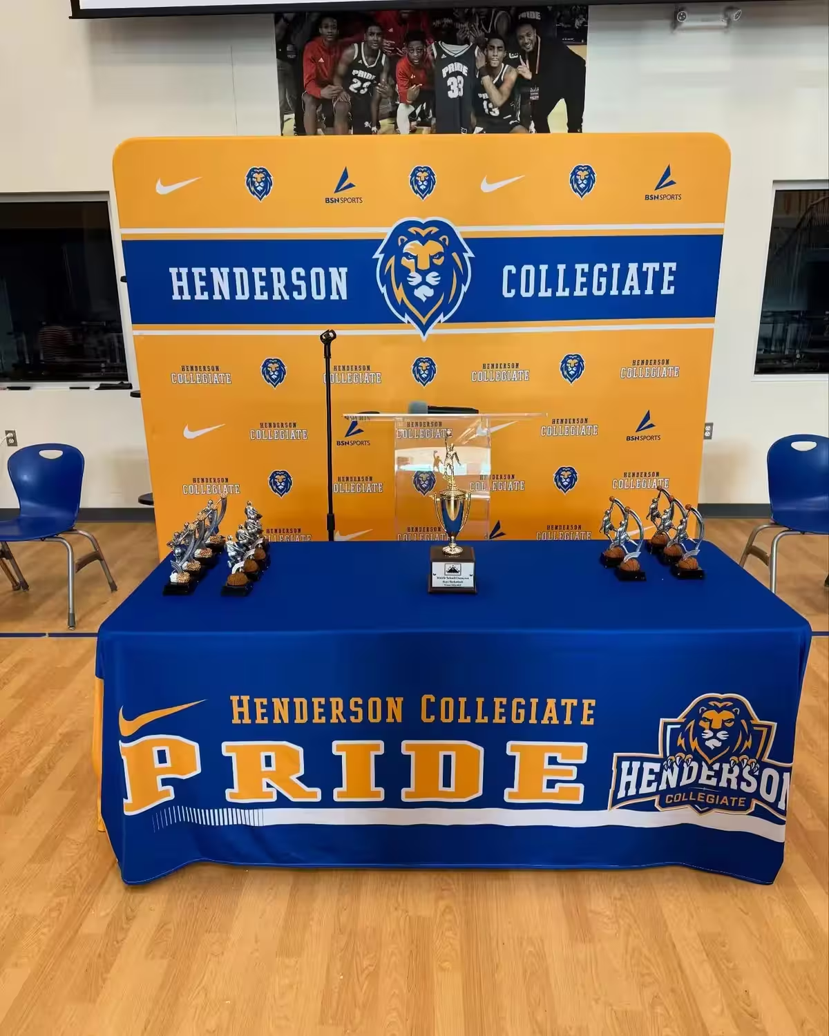
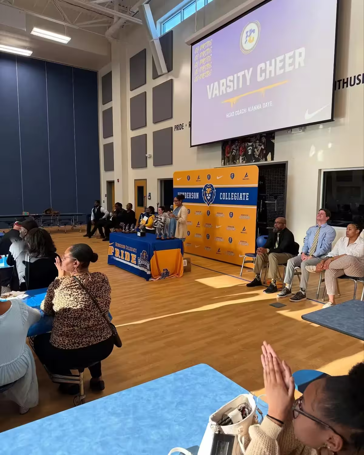
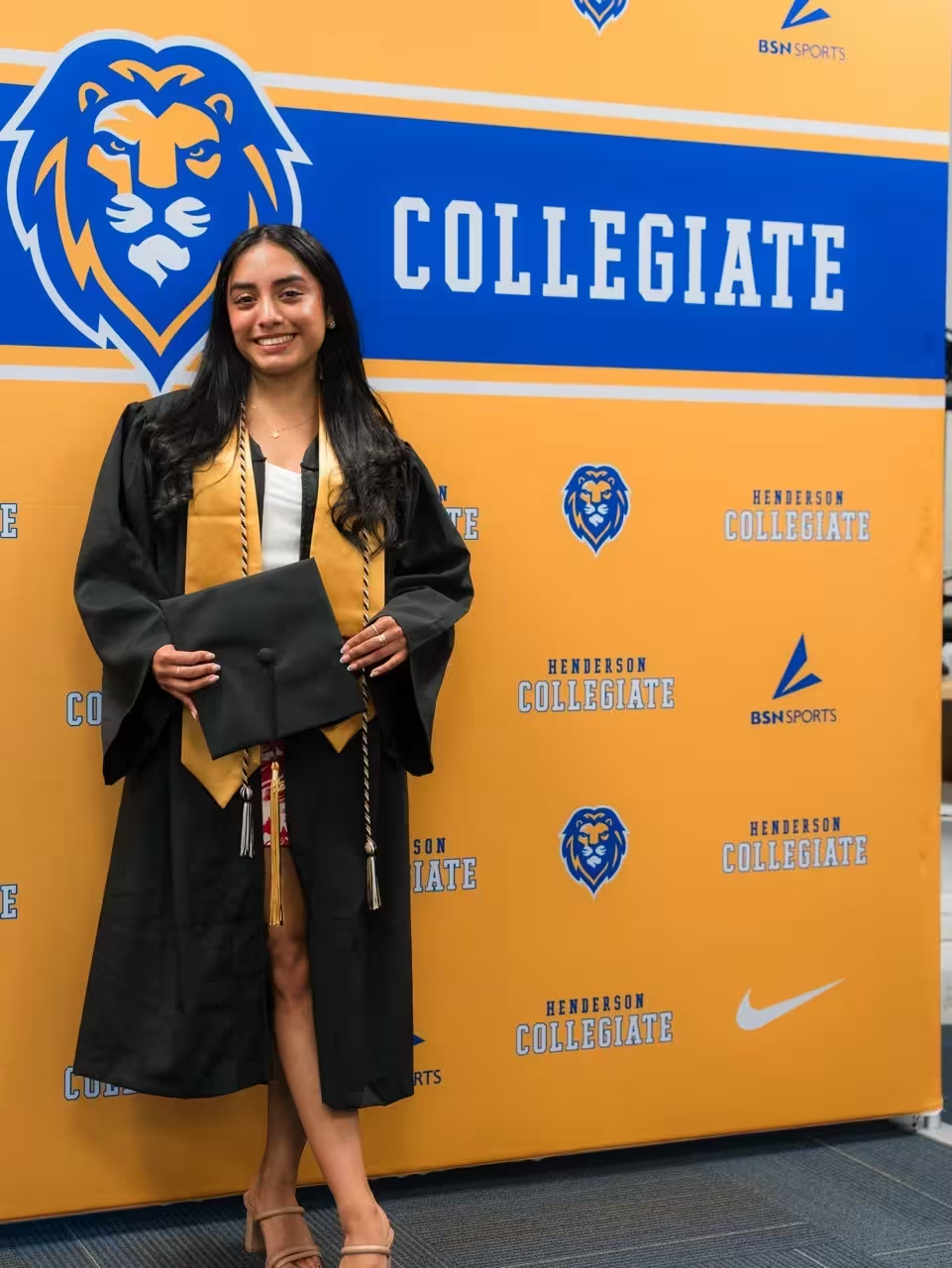
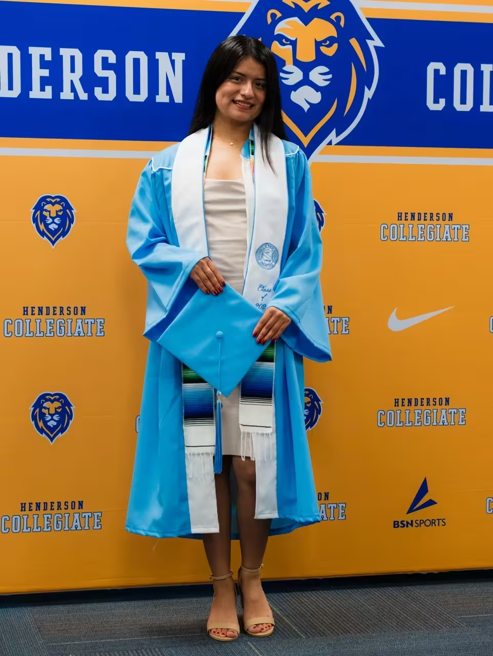
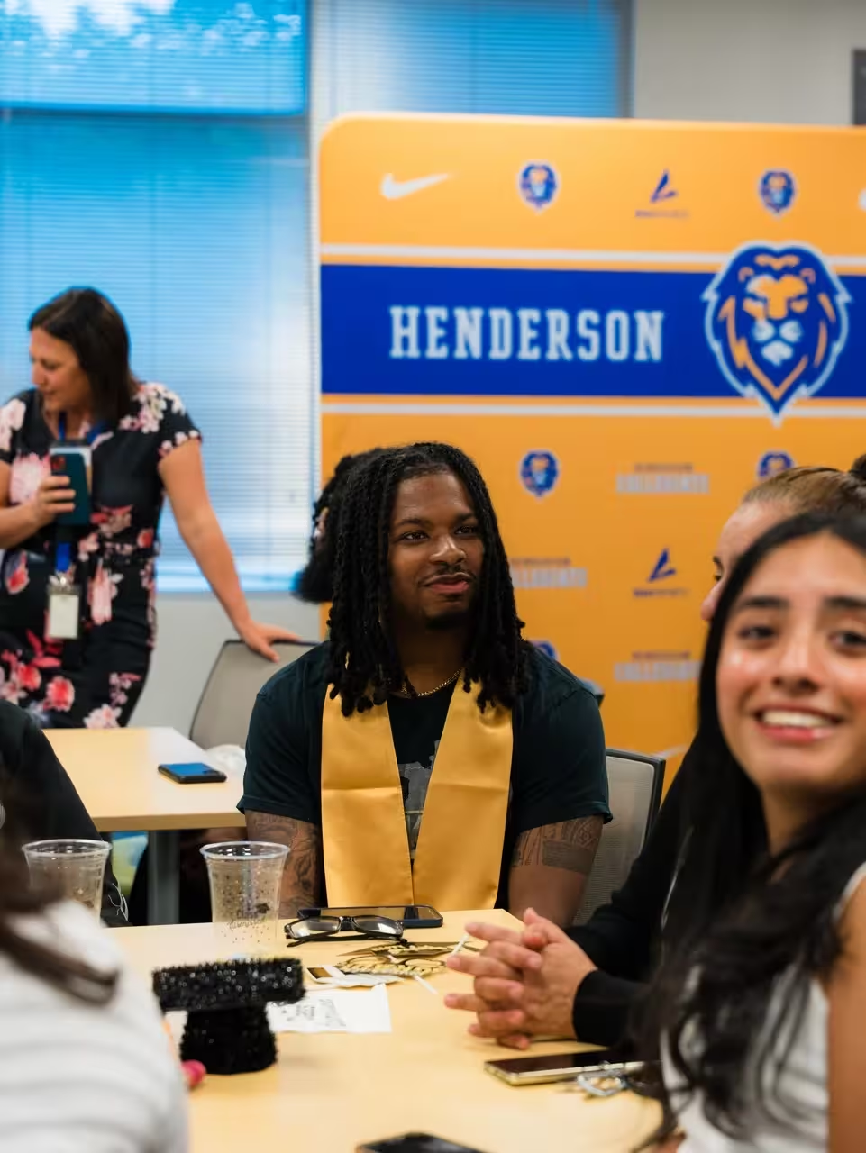
- Media backdrop for athletic events and announcements
- Trophy and awards presentation staging
- Entrance signage and wayfinding
- Banners and recognition displays
Digital and Print Applications
The identity system was implemented across multiple platforms:
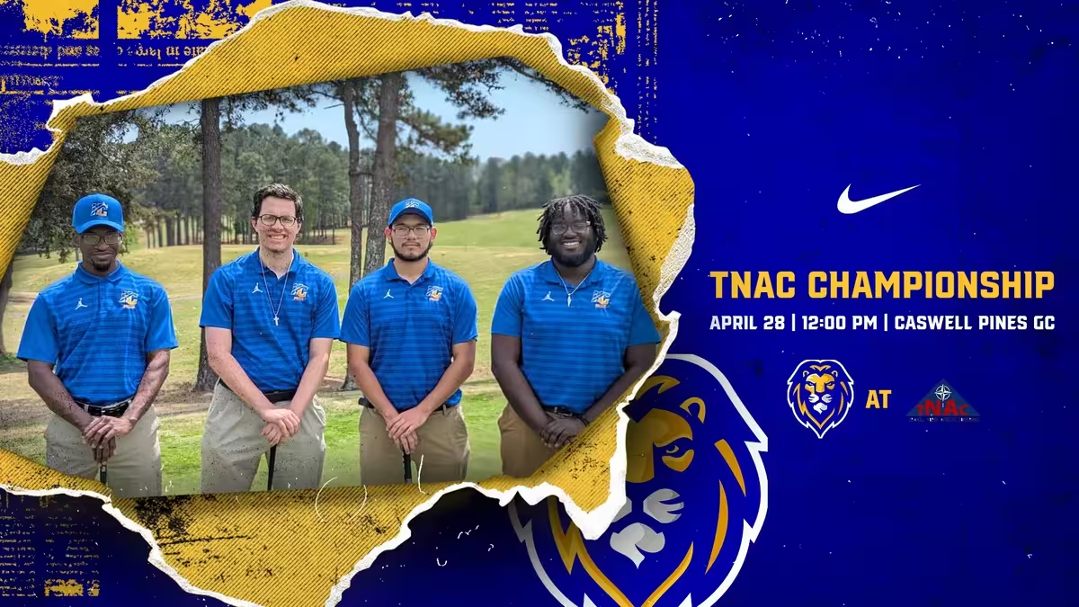
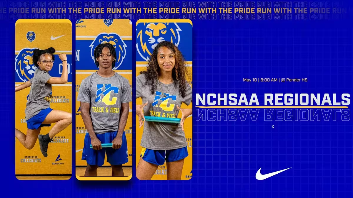
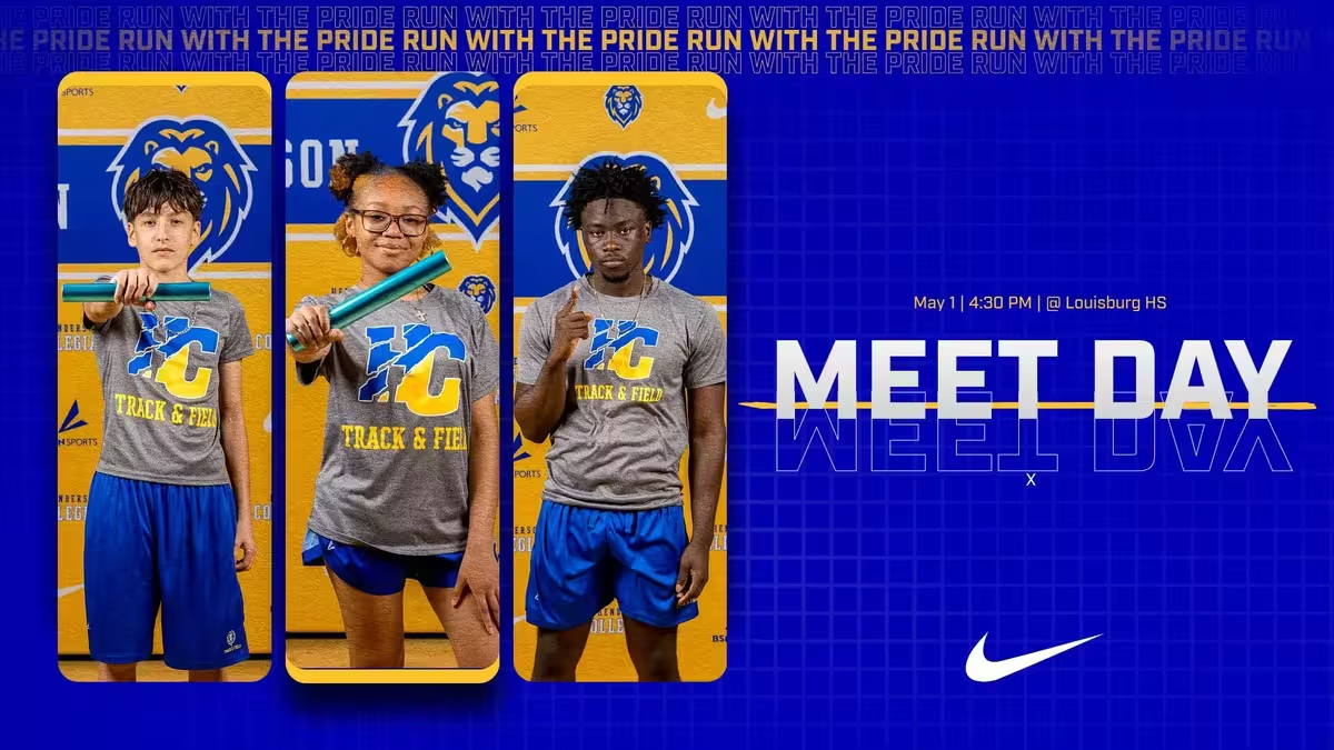
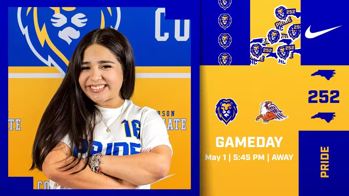
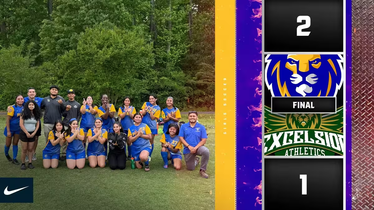
- Social media templates for game announcements
- Digital scoreboard graphics
- Event promotion materials
- Recruitment materials
- Athletic program materials
Implementation
The implementation strategy prioritized high-visibility applications to build immediate recognition and excitement:
- Athletics Launch: The new identity debuted with the basketball court reveal and updated athletic uniforms.
- Phased Rollout: Environmental graphics were installed in stages, beginning with the gymnasium and expanding to other campus locations.
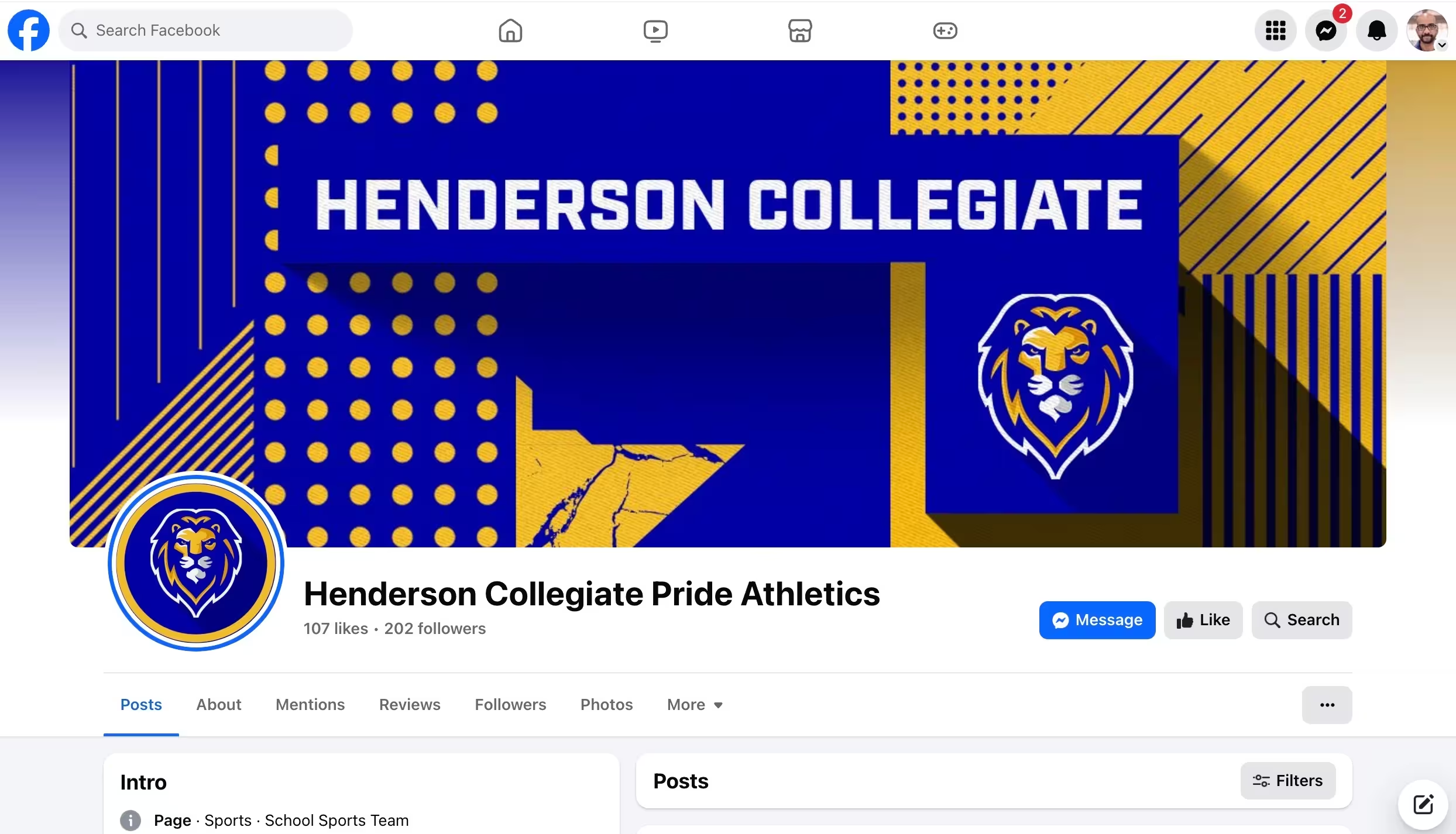
- Digital Integration: Social media channels and digital platforms adopted the new branding simultaneously.
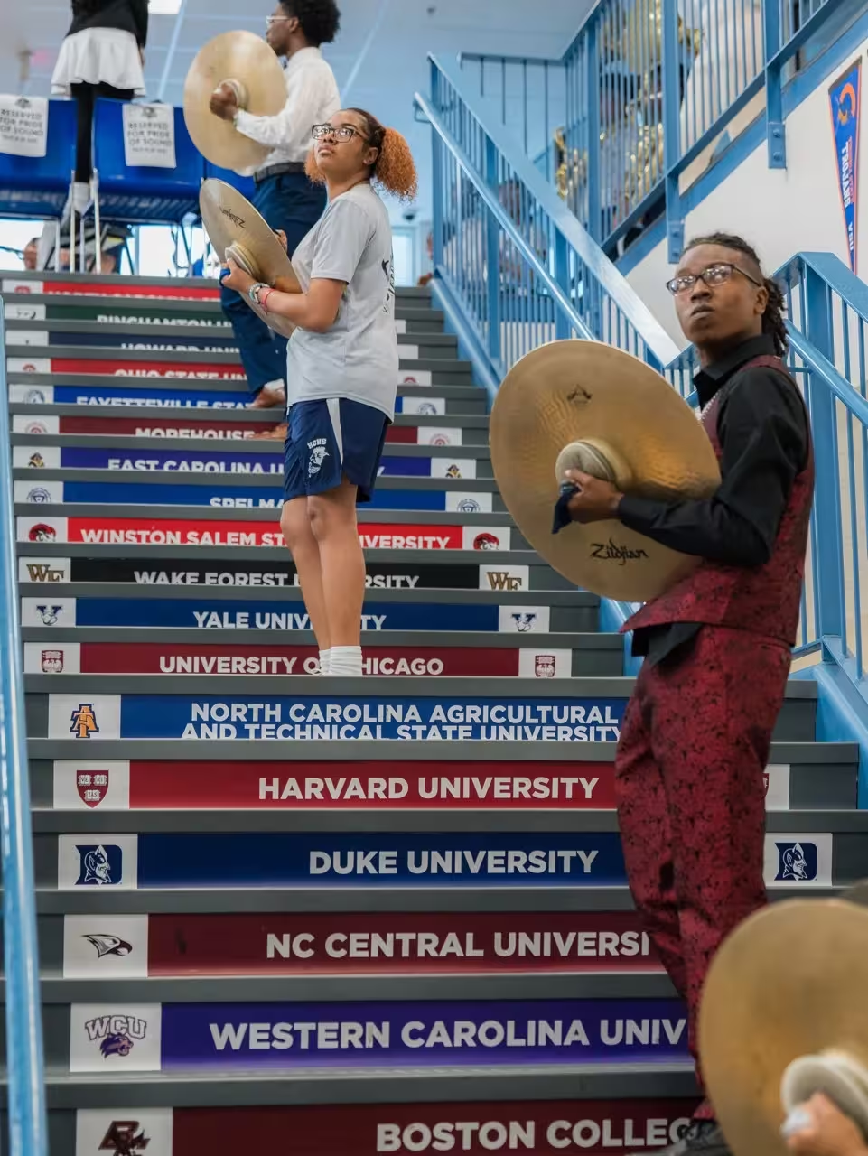
- Community Celebration: A community event unveiled the complete identity system, featuring student athletes and musicians showcasing branded uniforms and materials.
- Merchandise Program: A curated collection of branded merchandise allowed students, families, and supporters to embrace the new identity.
Results and Impact
Measurable Results
The Henderson Collegiate brand system delivered transformational outcomes:
Immediate Impact:
- 100% Board approval on the first presentation—no revisions required
- Basketball court reveal generated 15,000+ social media impressions in the first week
- Spirit wear program launched with 450+ items sold in the first month (previously averaging 20/month)
Long-Term Growth:
- Athletic participation increased 34% in the first year after brand launch
- Student enrollment applications rose 18%, with families specifically citing the “professional feel” during tours
- Community recognition: The lion mascot became the #1 recognizable symbol in Henderson within 18 months (community survey data)
- Band program recruitment increased 40%, with students citing the “Pride of Sound” sub-brand as a key factor
Board Room Metrics:
- Every athletic uniform now uses the cohesive brand system (previously 7 different design approaches)
- Environmental graphics reduced from 12 vendors to 2, saving $8,400 annually in procurement costs
- Social media engagement increased 210% after implementing the branded template system
The comprehensive identity transformed Henderson Collegiate from a school with good academics to a recognizable brand with a unified culture—proving that visual identity directly impacts enrollment, engagement, and community pride.
Conclusion
The Henderson Collegiate brand identity system represents a comprehensive approach to educational branding, demonstrating how thoughtful visual design can unite diverse programs, build community, and elevate an institution’s presence. By treating the school’s brand as a comprehensive system rather than simply a logo, we created multiple touchpoints for students, families, and community members to connect with Henderson Collegiate’s mission and values.
This project exemplifies the power of strategic educational branding, showing how visual identity can transform a school’s culture and communication. The Henderson Collegiate lion has become more than a mascot – it’s a symbol of excellence, pride, and community that will serve the school for generations to come.
More School Branding Case Studies
Frequently Asked Questions
Why did Henderson Collegiate need a comprehensive brand identity system rather than just a logo?
Henderson Collegiate needed more than just a logo—they needed a complete visual language that could unify their academic programs, athletics, and extracurricular activities. The comprehensive system ensures consistency across all touchpoints, from basketball courts to band program materials, creating a cohesive experience that strengthens school pride and community recognition.
How does the lion mascot reflect Henderson Collegiate’s values and mission?
The lion was strategically selected to embody Henderson Collegiate’s core values. Its dignified, forward-facing stance represents leadership and confidence—essential qualities the school cultivates in its college-preparatory environment. The determined expression reflects academic rigor and excellence, while the overall design balances collegiate tradition with contemporary styling, mirroring the school’s approach to education.
What makes this identity system adaptable for different applications across the school?
The system was designed with versatility in mind. We created multiple variations of the lion mark, from the primary athletic logo to the specialized “Pride of Sound” band identity. Each maintains core design elements while adapting to specific contexts. The consistent color palette and typography system ensure cohesion whether applied to court designs, social media graphics, uniforms, or environmental signage.
How were the distinctive blue and gold colors selected and implemented across applications?
The vibrant blue and gold palette was chosen to create high contrast and visual impact across all applications. Blue conveys trust, stability, and excellence—qualities central to Henderson Collegiate’s mission. Gold adds energy and distinction, creating a premium feel appropriate for a high-achieving charter school. These colors were systematically applied across environmental graphics, digital media, and athletic venues to ensure immediate recognition and consistent representation.
What impact has the comprehensive branding had on school culture and community engagement?
The new identity system has transformed how students, faculty, and the community connect with Henderson Collegiate. Athletic participation has increased significantly, with students proud to represent the lion brand. The consistent application across campus environments has created a more unified school experience. Community recognition has improved, with the distinctive lion becoming an instantly identifiable symbol of excellence throughout Henderson. Perhaps most importantly, the comprehensive approach has strengthened the connection between academics and athletics, reinforcing that both are integral to the Henderson Collegiate experience.
