

Client
Bellalago Academy School
Location
Kissimmee, Florida (Osceola County School District)
The Challenge
The Problem: Bellalago Academy, a K-8 charter school serving over 1,200 students in Kissimmee, competed in one of Florida’s most active school-choice markets. Despite strong academic performance, the school lacked a cohesive visual identity that set it apart from neighboring public and charter options. The campus had no unifying mascot system, and materials produced by different departments used inconsistent colors, fonts, and graphics. The school’s lakeside setting in the Bellalago community offered a powerful branding opportunity that was going completely untapped.
The Impact: Without a professional brand identity, Bellalago Academy struggled to build visible school pride among its diverse K-8 student body. Spirit wear was minimal, campus signage did not communicate the school’s character, and parents comparing charter options had no immediate visual reason to associate Bellalago with quality. Athletic programs looked disconnected from the academic campus.
Our Task
Develop a comprehensive Mariners brand identity that would:
- Celebrate the school’s waterfront location with a distinctive nautical theme
- Create differentiation in the competitive Kissimmee charter school market
- Unify K-8 students under a single, cohesive mascot system
- Work across monument signage, spirit wear, athletics, and digital communications
- Include trademark support and vendor-ready implementation files
- Build lasting school pride and community recognition
Strategic Approach
Our discovery process revealed several key insights that guided the design direction. Bellalago Academy’s unique position as a charter school allowed for more creative freedom in branding while still requiring the professionalism expected of an academic institution. The school’s lakeside location in the Bellalago community provided rich thematic territory, and the staff’s commitment to “navigating” students toward success created natural connections to maritime symbolism that resonated with families and faculty alike.
The ship’s wheel was selected as the central identity element because it represents guidance, direction, and steady leadership, which are values at the heart of Bellalago’s educational mission. The navy, lime, and teal color palette was strategically chosen to evoke water and sky while standing boldly apart from the red-and-blue palettes that dominate most Florida school brands. The lime keyline accent adds energy and youthfulness appropriate for a K-8 campus, while the deeper navy and teal tones maintain institutional credibility.
Design Development
The Mariners crest centers on a classic ship’s wheel rendered with contemporary geometric styling, functioning as both the school’s mascot symbol and its institutional mark. The navy wheel features lime keylines and teal fills with a compass-star detail that reinforces the nautical theme. Stacked wordmarks present “BELLALAGO ACADEMY” above the bold geometric “MARINERS” designation, creating a balanced composition with clear visual hierarchy that reads well from stadium distance and up close on a student’s backpack.
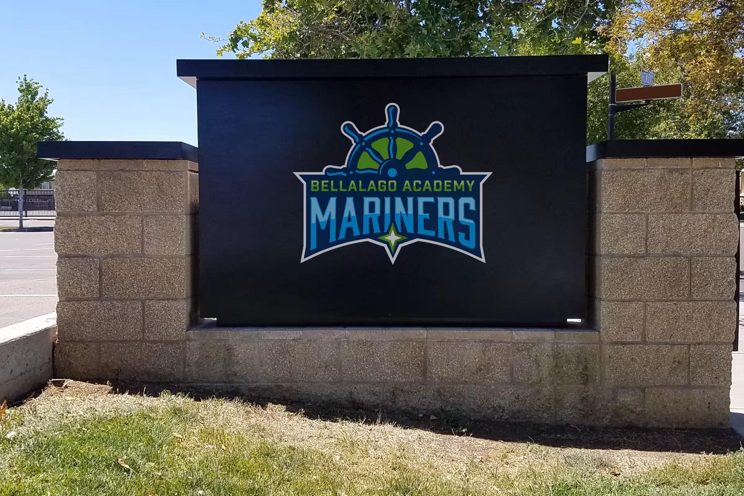
The identity system was deployed across six primary touchpoints:
- Monument signage: High-contrast Mariners badge on black panel for drive-by visibility at campus entry
- Campus facade: Mounted crest on the main building for architectural identification
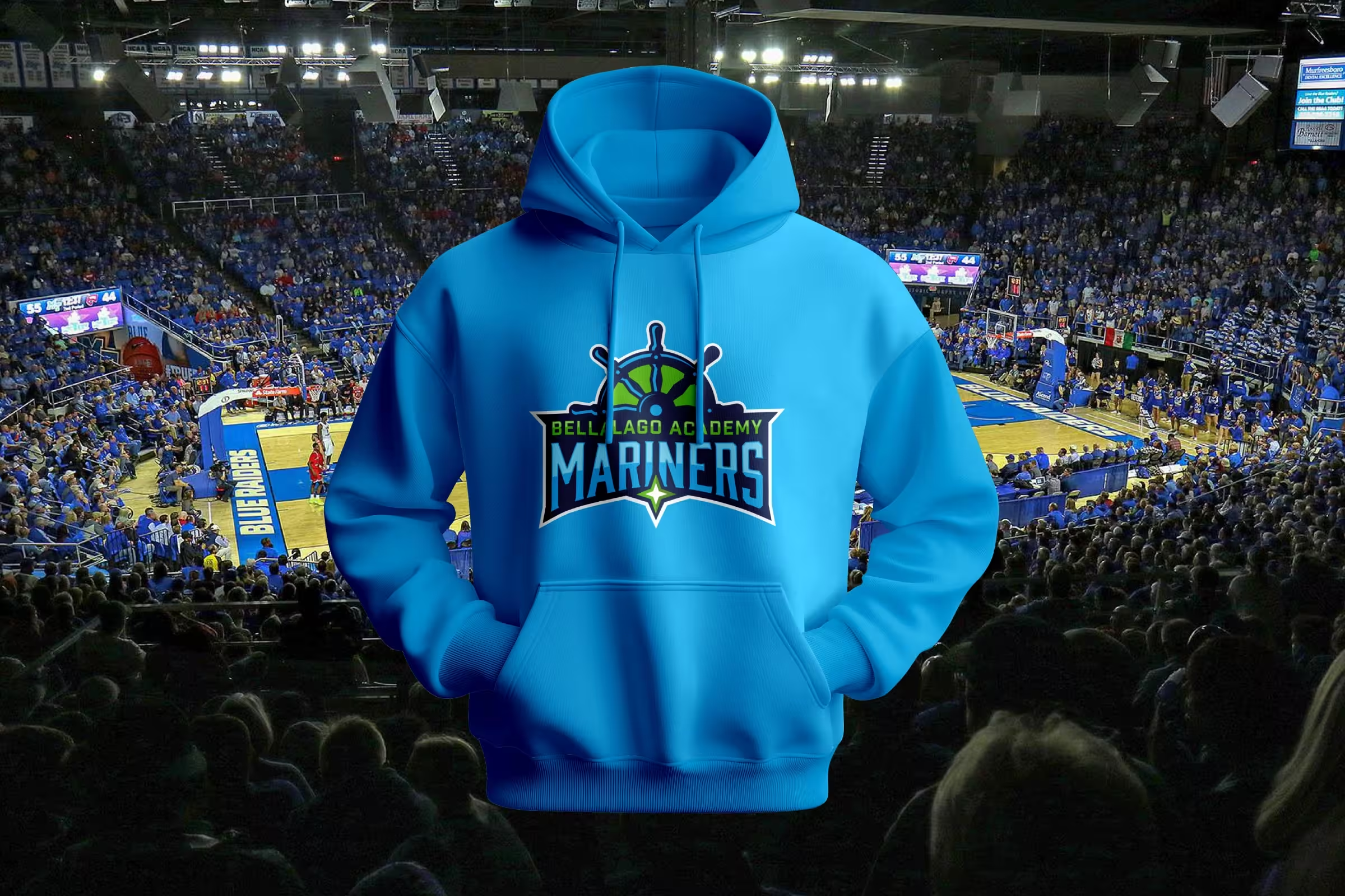
- Spirit wear: Electric-blue hoodies, performance tees, and accessories featuring the Mariners crest
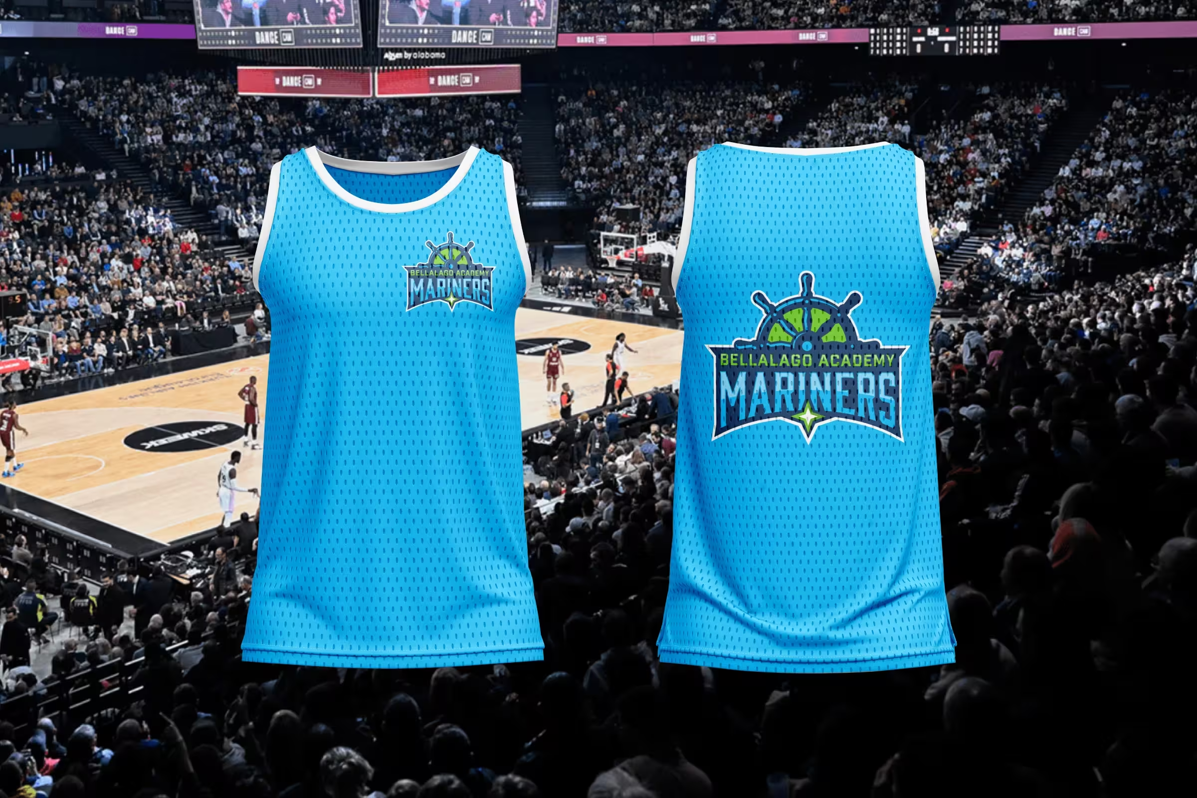
- Athletics: Basketball jerseys with front chest micro crest and full back crest for game-day branding
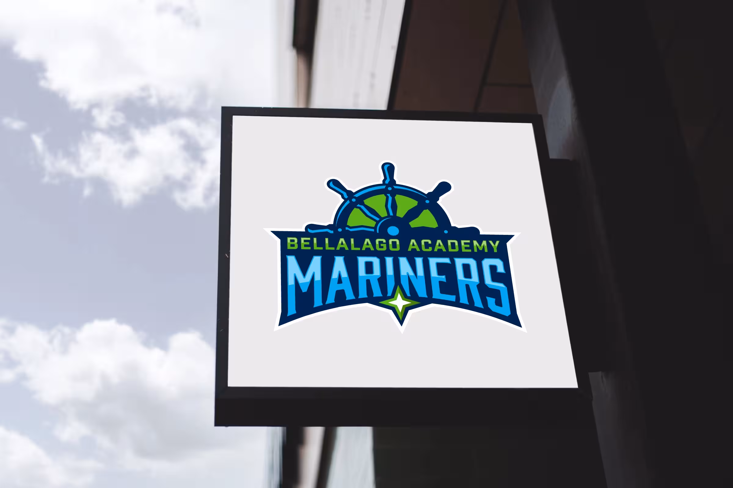
- Wayfinding: Exterior blade signs on white field for corridor and entrance navigation
- Administrative materials: Letterhead, enrollment packets, and digital templates
Results
The Mariners identity transformed Bellalago Academy from a charter school with no visual anchor into one of the most recognizable campuses in the Kissimmee market. The professional nautical brand replaced years of inconsistent graphics with a unified system that appears across every student and family touchpoint. Monument signage gives the school immediate curb appeal, while the athletic jersey system unified sports programs across the K-8 campus. Spirit wear adoption grew significantly as families responded to the quality and distinctiveness of the merchandise designs. The brand now serves as a powerful enrollment tool, giving prospective families a clear and memorable impression of the school’s identity and values.
Frequently Asked Questions
Why a nautical theme instead of an animal mascot? Bellalago’s lakeside location and educational philosophy of “navigating students toward success” made the maritime theme a natural fit. The ship’s wheel creates a distinctive identity that no other school in the district shares, giving Bellalago strong brand differentiation in a crowded charter market.
How does one identity work across kindergartners and eighth graders? The geometric ship’s wheel design is sophisticated enough for older students while remaining visually engaging for younger children. The clean, bold construction avoids childish styling, allowing K-8 students to connect with the same brand without feeling that it is designed for a different age group.
Can the brand support future campus expansion? Yes. The crest format, standalone wheel mark, and wordmark variations provide building blocks for future applications including additional campuses, digital media, environmental graphics, and expanded merchandise lines without requiring a redesign.
Read our complete school branding guide.
Everything you need to know to create a kick-ass school brand that creates results.