
School Branding Blog
High School Mascot Design: Why the Varsity Mark Sets the Standard for Everything

Related: Complete Guide to School Mascot Design | School Mascot vs Logo: Key Differences | Athletic Program Branding
Every school in a district has a logo. But the high school mascot is the one people tattoo on their arms.
It goes on football helmets and basketball courts. It gets painted on water towers and sewn onto letter jackets. It shows up on booster club t-shirts, senior class rings, yard signs during homecoming, and the back window of every parent’s SUV. Twenty years after graduation, alumni still wear it.
No other mark in a school district works this hard. And no other mark is this unforgiving when the design falls short.
If you’re a superintendent, athletic director, or school board member about to invest in a mascot redesign, here’s the case for starting at the high school and getting the varsity mark right first — because everything else in the district will flow from it.
The High School Mascot Is the Anchor Mark
In districts where every school shares the same mascot name — the Eagles, the Hawks, the Bulldogs — the high school version is the one that defines the character. It’s the most public-facing, the most frequently reproduced, and the one with the widest range of applications.
Think about where a high school mascot actually shows up:
- Football helmets — the single most visible application in any school’s brand
- Center court and midfield logos — large-scale, high-visibility
- Varsity letter jackets and championship banners
- Stadium signage, press backdrops, and livestream overlays
- Graduation programs, alumni communications, and fundraising materials
- Spirit wear sold at every game, every week, for four years
The middle school mascot shows up on a few t-shirts and maybe a gym wall. The elementary mascot goes on a newsletter header and a morning announcement slide. The high school mascot goes on everything, in every format, at every size, under every condition.
That’s why we call it the anchor mark. You design it first. You get it right. Then you adapt it for the rest of the district.
What Makes High School Mascot Design Different
Designing a mascot for a high school isn’t the same as designing one for an elementary school or even a college. The high school mark lives in a specific context with specific demands.
It Has to Work in Athletics First
This is the non-negotiable. A high school mascot that doesn’t work on a football helmet, a basketball jersey, and a gym floor has failed its primary job.
That means the design needs to:
- Read clearly at small sizes — a helmet decal is roughly 4 inches wide
- Hold up in one color — embroidery, screen printing, and etching all require a single-color version
- Look aggressive enough for competition — this isn’t a cartoon character waving at kids, it’s a competitive identity
- Reproduce cleanly on dark and light backgrounds — home whites and away darks
Too many school mascots are designed as marketing illustrations first and athletic marks second. The result is a character that looks great on a website banner but falls apart the moment a vendor tries to put it on a helmet.
Design for the helmet first. Everything else gets easier.
It Has to Scale from 2 Inches to 20 Feet
The same mascot that fits on a lapel pin has to fill a gymnasium wall. That range — from embroidered polo to painted mural — is unique to school branding. Corporate logos rarely face this kind of scale challenge.
The design implications:
- Fine details disappear at small sizes. Feather textures, individual teeth, detailed eyes — all of it turns to mush on a 2-inch embroidery. The mark needs to hold its identity with simplified details.
- Simple shapes look empty at large sizes. A mark that’s too stripped-down feels underwhelming when it’s blown up to 15 feet on a gym wall. There needs to be enough visual weight and character to fill the space.
- The solution is structured complexity. Enough detail to be interesting at scale, but organized in clear shapes that read at any size. The best school mascots have bold silhouettes with controlled interior detail.
It Represents Competition, Not Just Community
Elementary mascots represent belonging. Middle school mascots represent identity. High school mascots represent competition.
When a student puts on a varsity jersey with your mascot, they’re not just saying “I go to this school.” They’re saying “I compete for this school.” The mascot is war paint. It’s the thing the student section screams about. It’s the image opposing teams see across the field.
The emotional register is different. A high school mascot needs:
- Intensity — the expression should project confidence, aggression, or focus
- Forward energy — the character should feel like it’s in motion or ready to move
- Presence — it should command respect, not just recognition
This doesn’t mean every high school mascot needs to be snarling. Some of the strongest marks project quiet confidence — a hawk with a locked gaze, a bulldog with its jaw set, a panther mid-stride. The point is that the energy matches the context. High school athletics is competitive. The mascot should feel like it belongs in that environment.
The Cascade Effect: How the Anchor Mark Shapes the District
Once the high school mascot is locked, it becomes the reference point for every other school in the district.
Expression Adaptations
The most cost-effective approach for multi-school districts: keep the same character and adjust the expression for each grade level.
- High school — fierce, competitive, athletic
- Middle school — confident, spirited, standing tall
- Elementary — friendly, energetic, approachable
- Primary — warm, welcoming, soft features
The bones of the character don’t change. The proportions don’t change. The style doesn’t change. What changes is the emotional register — the expression softens as you move down in grade level. A kindergartner sees the same hawk as the varsity quarterback, but the kindergartner’s version has bigger eyes and a warmer smile.
This approach works because the high school design established the character’s DNA. The beak shape, the feather style, the color application, the line weight — all of that is defined in the anchor mark and carried through to every adaptation.
The Full Brand System
For districts that want every school to have its own complete identity — not just a modified mascot — the anchor mark is still the starting point. The high school design establishes:
- The character design that adapts to each school
- The secondary mark format that gets replicated for every building
- The typography system that ties every school name together
- The brand pattern that shows up on spirit wear, signage, and backgrounds
When you invest in the full system at the district level, every school benefits from the design thinking that went into the high school mark. The middle school doesn’t get a lesser version — it gets a complete brand system built on the same foundation.
Five Mistakes That Kill High School Mascot Designs
After designing mascots for over 250 schools, we see the same problems over and over. Here are the ones specific to high school marks.
1. Designing for the Website Instead of the Helmet
The most common mistake. Someone creates a beautiful, detailed illustration of a mascot with shading, gradients, and realistic textures. It looks incredible as a hero image on the school website. Then a vendor asks for a one-color version for helmet decals and the whole thing collapses.
The fix: Start with the one-color version. If the mascot doesn’t work in flat black on white paper, it doesn’t work.
2. Making It Too Friendly
Elementary schools need friendly mascots. High schools don’t. When a mascot designed for a high school looks like it belongs in a children’s book, athletes don’t want to wear it. The student section doesn’t rally behind it. It quietly becomes a source of embarrassment instead of pride.
The fix: Design for the varsity athlete first. If a senior captain would be proud to wear it on their jersey, the design is working.
3. Ignoring the Silhouette
Cover the mascot in a solid color so you can only see the outline. If you can still identify what animal it is and what it’s doing, the silhouette is strong. If it looks like a blob, the design relies too much on interior detail and will fail at small sizes.
The fix: Design the silhouette first, then add interior detail. The shape should tell the story on its own.
4. Chasing Trends Instead of Building Permanence
A mascot designed in this year’s trendy style will look dated in five years. Schools aren’t startups — they don’t rebrand every three years. A high school mascot needs to hold up for a decade or more.
The fix: Study marks that have lasted. The best school mascots use timeless techniques — bold shapes, clean lines, confident expressions. They don’t reference a specific era.
5. Designing by Committee Without a Clear Brief
When twelve stakeholders each get a vote on every design detail — beak angle, eye color, feather count, expression intensity — you end up with a compromise that nobody loves. The mascot becomes a collection of negotiated features instead of a cohesive character.
The fix: Get alignment on the brief, not the design. Agree on the personality (fierce? confident? energetic?), the application priorities (helmet? gym floor? spirit wear?), and the non-negotiables (must include school colors, must work in one color). Then let the designer design.
What a Strong High School Mascot Delivers
When the anchor mark is done right, the returns compound across the entire district:
Athletic recruitment. A strong varsity identity makes the athletic program look established and serious. Student-athletes considering transfer options notice this. So do their parents.
Spirit wear revenue. Nobody buys a t-shirt with a mascot they’re embarrassed by. A mark that students and alumni are proud to wear drives organic merchandise sales — and every shirt is a walking billboard for the school.
Community identity. In small towns especially, the high school mascot often becomes the community’s identity. It goes on city limit signs, local business windows, and community event banners. A strong mark elevates the whole town’s sense of pride.
District cohesion. When the high school mark is the foundation for every other school’s identity, the district feels unified. A family moving through the system — primary to elementary to middle to high school — experiences one continuous identity that matures with their child.
Enrollment impact. First impressions matter. When a prospective family visits your school and sees a cohesive, professional brand identity anchored by a strong mascot, it signals that the school takes itself seriously. That perception influences enrollment decisions, especially in competitive choice and charter environments.
The Process: How We Design Anchor Mascots
Our approach to high school mascot design follows a specific sequence that’s been refined across 250+ school projects.
Week 1: Discovery. We learn the school’s history, rivalries, community culture, and what the mascot means to students, alumni, and staff. We document every current application — helmets, gym floors, signage, spirit wear — to understand the full scope of where the mark needs to work.
Week 2: Concepts. We develop 3-5 distinct mascot directions, each presented with real-world mockups showing how the mark looks on a football helmet, center court, a t-shirt, and a letterhead. Not generic mockups — actual applications specific to your school.
Weeks 3-4: Refinement. The selected direction goes through up to three rounds of revisions. We refine the expression, the proportions, the detail level, and test it across every application. We also develop the secondary mark, typography system, and brand pattern during this phase.
Weeks 5-6: Delivery. Every school receives a complete file package — vector, print, digital, and embroidery-ready formats. Full-color, one-color, and reversed versions of every mark. No vendor questions, no delays.
For districts with multiple schools, the adaptation process adds 1-2 weeks depending on the scope. Expression adaptations are faster. Full brand systems for every school take more time but deliver a complete district identity.
Your Mascot Is Your Most Valuable Brand Asset
Logos get updated. Websites get redesigned. Marketing campaigns come and go. But a well-designed mascot can represent a school for decades. It becomes part of the institution’s DNA — the thing that connects a current freshman to a 1985 graduate.
That’s why the high school mascot deserves more investment and more strategic thinking than any other mark in the district. It’s not decoration. It’s identity. And when you get it right at the varsity level, everything else falls into place.
Ready to design your anchor mascot? Learn about our mascot design process or schedule a call to discuss your project.
Related reading:
We Build and Manufacture Mascot Costumes
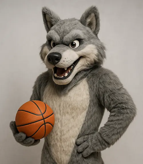
A professionally built mascot costume creates unforgettable moments at games, rallies, and community events.
See Full Details →
Design to Delivery
We manage everything
6-12 Week Delivery
In time for your season
Safety First
Ventilation & visibility
Custom Projects
Professional quality
About Mash Bonigala

Mash Bonigala is the Founder & CEO of School Branding Agency. Over the past 15 years, he's helped 250+ K-12 schools transform their brand identity and drive enrollment growth. From charter schools to public districts, Mash specializes in creating mascot systems and brand strategies that rally communities, boost school spirit, and convert prospects into enrolled families. Schedule a Zoom call to discuss your school →
Mascot logo design
Get an enrollment-ready mascot your community loves
Start with our mascot logo design service. We’ll craft a distinctive, on‑brand mascot system and rollout plan tailored for your school.
Get a Free ConsultationRelated
Charter Application Branding - Professional Identity for Authorizer Approval
Professional charter application branding that demonstrates operational readiness to authorizers. Complete brand identity, website, and application materials. Charter-specific packages for charter schools.
View detailsRelated
Charter School Branding - Mascots & Identity (2025)
We help charter schools build mascots and identity systems that rally communities and support enrollment. See packages and proof.
View details