


Client
Flora Ridge Elementary School
Location
Kissimmee, Florida (Osceola County School District)
The Challenge
The Problem: Flora Ridge Elementary School, a public elementary school in Kissimmee known region-wide for its arts-integrated curriculum, needed a professional identity that symbolized renewal, creativity, and artistic excellence. The school’s commitment to weaving the arts into every aspect of learning was a powerful differentiator within the Osceola County district, but the existing visual presence did not reflect this creative energy. Without a cohesive brand system, campus communications and spirit wear relied on inconsistent artwork that failed to communicate what makes Flora Ridge unique.
The Impact: Without a unified Phoenix identity rooted in the school’s arts-first mission, Flora Ridge missed opportunities to visually reinforce its distinctive curriculum at every touchpoint. Students lacked a dynamic, creative symbol that connected their classroom experience to a larger sense of identity and pride. The campus offered no branded signage that would communicate the school’s arts-integrated approach to visiting families, and spirit wear options were limited by the absence of professional, production-ready artwork.
Our Task
Develop a complete Phoenix brand identity system that would:
- Create a dynamic Phoenix mascot reflecting transformation and artistic excellence
- Remain approachable and engaging for elementary-aged students
- Reinforce the school’s arts-integrated curriculum through vibrant, creative design
- Work across monument signs, wayfinding, spirit wear, and administrative materials
- Strengthen Flora Ridge’s regional reputation as an arts-first school
- Provide vendor-ready files for consistent production across all applications
Strategic Approach
Our research into elementary schools with specialized arts programs revealed the importance of creating identities that communicate creative energy while maintaining educational substance. The visual system needed to inspire young imaginations while reassuring parents and the community of the school’s academic foundations. The phoenix was selected because it symbolizes transformation, renewal, and unlimited potential, all perfect metaphors for an arts-integrated educational environment where creativity drives learning.
The mythical bird represents imagination and artistic expression, and the rising symbolism connects to growth, achievement, and constant improvement. The distinctive phoenix silhouette creates immediate recognition across applications, and the character offers rich visual territory for dynamic, artistic interpretations that reflect the school’s creative spirit.
The color palette of royal blue, bright gold, and white was strategically chosen to create a bold, energetic presence through the dominant blue background while adding creative warmth and brilliance through the golden phoenix elements. The strong contrast ensures visibility across applications, and the balanced combination projects both artistic expression and educational credibility.
Design Development
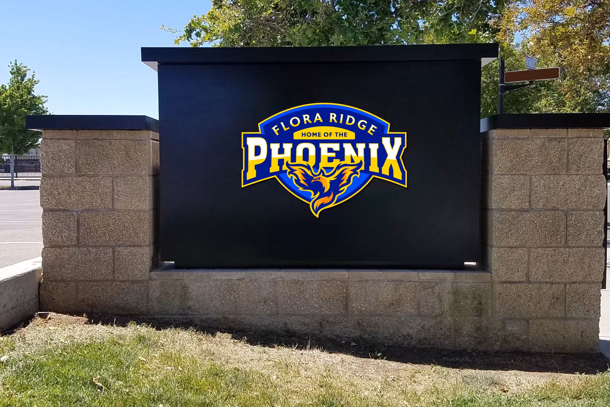
The Phoenix crest features a distinctive, flowing phoenix centered within a shield-shaped framework, designed for maximum visual impact and immediate appeal to elementary-aged children. The “PHOENIX” wordmark is boldly positioned above, with the “FLORA RIDGE” designation curving along the top of the shield and “HOME OF THE” as a connecting element. The flowing, flame-like phoenix creates a dynamic focal point suggesting creative energy and transformation.
The system was deployed across six primary touchpoints:
- Campus monument sign: Primary Phoenix crest applied to matte black entry marker for high-visibility school identification
- Interior wayfinding: Compact Phoenix badge on white panels for offices, reception, and corridor navigation
- Spirit wear: Youth t-shirts, hoodies, and apparel with center-chest Phoenix crest for students and families
- Headwear: Embroidered Phoenix badge on caps for retail-ready spirit wear
- Administrative stationery: Phoenix crest on binders, letterhead, and official school documents
- Digital presence: Website headers, social media profiles, and digital communications
Results
The Phoenix identity gave Flora Ridge Elementary a vibrant, arts-driven visual presence that directly reinforces the school’s creative mission. The dynamic phoenix character became a powerful symbol of transformation and artistic excellence that students and families connect with on an emotional level. The professional brand system brought cohesion to every campus touchpoint, from the monument sign at the school entrance to classroom materials and spirit wear. The unified identity strengthened Flora Ridge’s regional reputation as an arts-integrated school and gave the community a bold, recognizable symbol of creative pride.
Frequently Asked Questions
How does this brand reflect the arts-integrated curriculum? The phoenix mascot embodies transformation, creativity, and renewal, all core values of an arts-integrated school. The dynamic, flowing design and vibrant color palette communicate creative energy at every touchpoint, reinforcing the message that Flora Ridge is a place where the arts and academics work together.
What grade levels does this brand serve? The Phoenix identity was designed for an elementary school environment, with a mascot character that inspires young imaginations while maintaining the institutional credibility expected by parents and the broader community.
Can this brand system work for school performances and art events? Yes. The Phoenix crest and standalone mark are designed to work across art shows, school performances, creative competitions, and any school-sponsored event, providing a unified visual identity that celebrates the school’s artistic mission.
Read our comprehensive school branding guide.
Everything you need to know to create a kick-ass school brand that creates results.