Client: DaVinci Academy
Location: Ogden, Utah
Project: Dragon Mascot & Brand Identity System
Background: DaVinci Academy, an Ogden charter school (K-12) blending creativity and STEM excellence, had outdated identity not reflecting their innovative curriculum.
Our Task: Create powerful dragon mascot symbolizing innovation and creative power while reflecting arts-STEM integration for K-12 charter positioning.
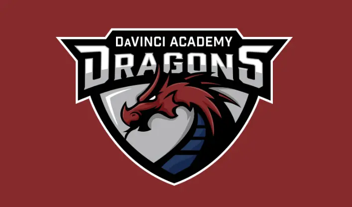
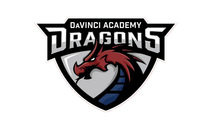
Our Action: Designed forward-facing red dragon with silver shield, blue accent stripes, geometric typography—sophisticated system for multi-grade appeal.
Outcome: Dragons identity deployed K-12. Brand authentically represents multifaceted educational approach while distinguishing DaVinci in competitive charter school landscape.
Strategic Approach
Our process began with comprehensive research into DaVinci Academy’s history, educational philosophy, and community perception. Through stakeholder interviews, student workshops, and competitive analysis, we gained critical insights that guided our design approach.
Leonardo da Vinci’s legacy as the quintessential Renaissance thinker – equally versed in art, science, and engineering – provided rich symbolic territory for the school’s visual identity. The dragon emerged as the perfect mascot embodiment of this legacy, representing:
- Intelligence and wisdom (core educational values)
- Power and protection (fostering student confidence)
- Innovation and creativity (the school’s pedagogical focus)
- Mythic tradition across cultures (reflecting diversity and global perspectives)
The strategic color palette centered on deep red, silver, black, and blue accents – colors that communicate strength and intelligence while creating a distinctive presence in the educational landscape.
Design Development
The DaVinci Dragons identity was developed through a multi-phase process:
Mascot Creation
The dragon mascot was meticulously crafted to balance several key attributes:
- Forward-facing posture with an alert, intelligent expression
- Dynamic profile that suggests movement and progress
- Sharp, angular forms that reference precision and analytical thinking
- Distinctive head crest and scale patterns that create visual interest and recognition
- Shield integration that provides structure and versatility across applications
The final design features a striking red dragon with silver accents, set against a shield backdrop that references tradition while maintaining contemporary appeal. The dragon’s expression conveys determination and intelligence—qualities DaVinci Academy cultivates in its students.
Typography & System Elements
The typography system was selected to complement the mascot’s angular qualities while ensuring legibility across applications:
- Bold, geometric letterforms for “DRAGONS” create impact and recognition
- Clean, structured typography for “DAVINCI ACADEMY” establishes institutional credibility
- Consistent proportional relationships that maintain harmony across applications
Application Development
The identity system was extended across multiple applications:
- Primary and secondary logo variations
- Spirit marks for student organizations
- Academic program identifiers
- Athletic uniforms and equipment
- School environment graphics
- Digital platforms and communications
- Merchandise and spirit wear
Implementation
The implementation strategy focused on building immediate recognition while allowing for phased adoption across all school touchpoints:
- Community Introduction: The new identity was unveiled at a school-wide event that connected the dragon symbolism to DaVinci Academy’s educational mission.
- Environmental Graphics: Strategic placement of the new identity in high-visibility campus locations established immediate presence.
- Digital Integration: The website, social media platforms, and digital communications were updated simultaneously to ensure consistent representation.
- Program Extension: Athletic uniforms, academic materials, and extracurricular programs adopted the branding in a coordinated rollout.
- Student Engagement: Students participated in “Dragon Pride” initiatives that built ownership and connection to the new identity.
Results & Impact
The DaVinci Academy Dragons identity has delivered significant benefits:
- Enhanced School Recognition: The distinctive dragon has become an immediately recognizable symbol in the Ogden educational community.
- Increased Student Engagement: Surveys show students across grade levels have embraced the dragon as a symbol of school pride.
- Unified School Experience: The consistent application of the identity system has created stronger connections between elementary and secondary programs.
- Marketing Effectiveness: Enrollment materials featuring the new branding have resulted in increased inquiries and applications.
- Community Pride: Parents and supporters have enthusiastically adopted spirit wear and merchandise, extending brand visibility throughout the community.
Conclusion
The DaVinci Academy Dragons identity exemplifies how thoughtful mascot design can authentically express an educational institution’s values and philosophy. By creating a visual symbol that embodies both creativity and analytical thinking, we provided DaVinci Academy with a powerful tool for building community, fostering school pride, and communicating their unique educational approach.
The dragon – a creature that has inspired imagination across cultures and throughout history – now serves as a fitting emblem for a school dedicated to nurturing the next generation of creative thinkers and innovators. This project demonstrates the strategic impact of aligning visual identity with educational mission, creating a brand that resonates with students, parents, faculty, and the broader community.
Read our school branding guide.
Everything you need to know to create a kick-ass school brand that creates results.
