Client
Woodbridge School District
Location
Woodbridge, Delaware
The Challenge
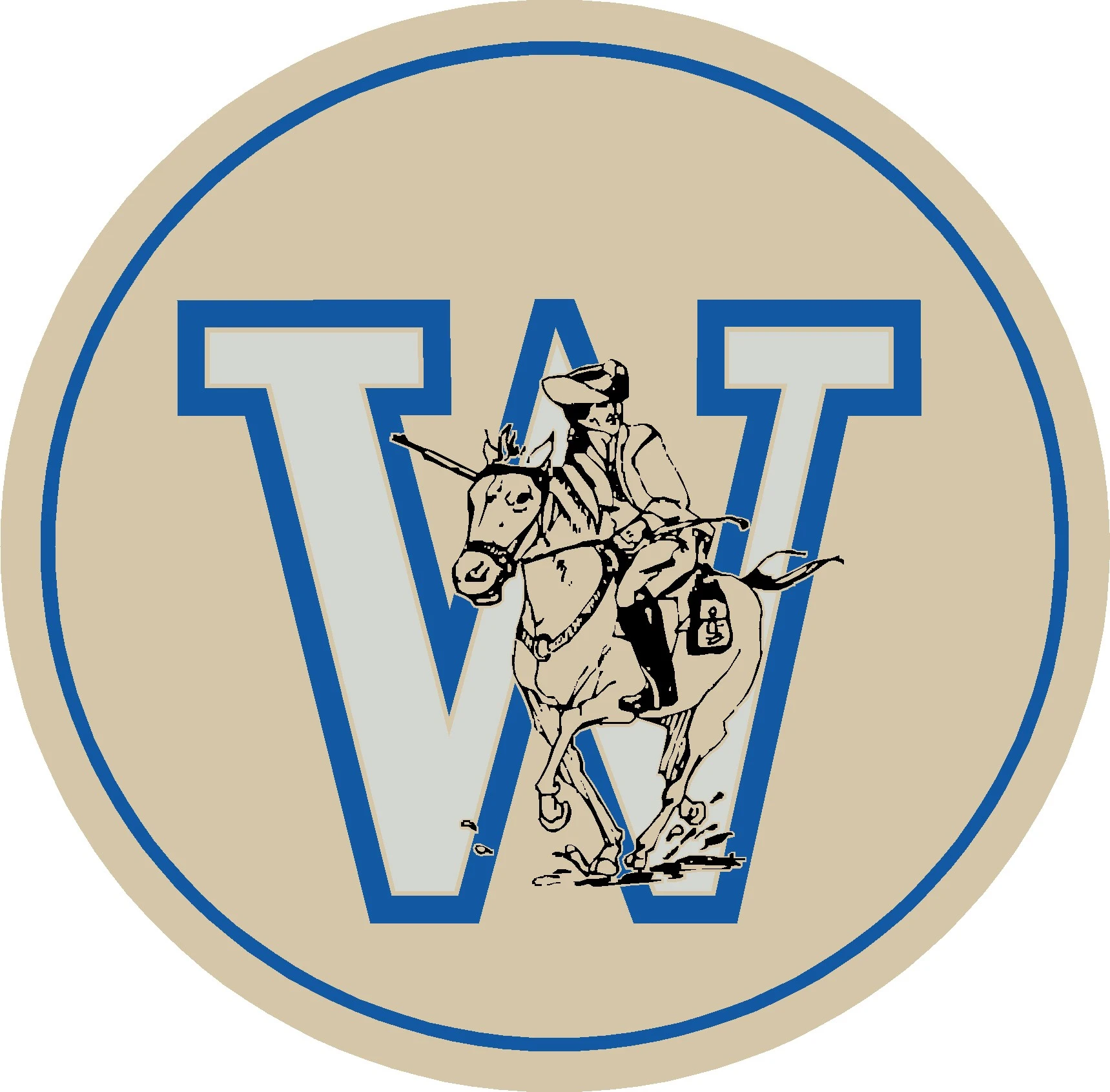
The Problem: Woodbridge School District operates four campuses serving K-12 students across the Bridgeville and Greenwood communities in Delaware. When the schools consolidated into a single district, they inherited a fragmented identity problem. Bridgeville had been using a “Mighty Mustang,” Greenwood had used a “Forester,” and the district office used a third generic mark that matched neither school’s heritage. Athletic teams, administrative offices, and individual campuses were all using different logos, colors, and naming conventions. Coaches sent conflicting artwork to vendors, parents received materials that looked like they came from different organizations, and students had no single rallying symbol to unite the district.
The Impact: The multiple identities diluted brand recognition throughout the community. Merchandise programs were disorganized, with vendors confused about which logo to print. There was no unified district pride, and the visual fragmentation reinforced the sense that the consolidated schools had not truly come together as one system.
Our Task
Create one unified Blue Raider mascot system that would:
- Honor both the Bridgeville Mustang and Greenwood Forester heritage in a single design
- Work across all four campuses with an elementary-friendly variant for younger students
- Unify athletics, administration, and academic communications under one identity
- Provide vendor-ready specifications in a comprehensive guidelines document
- Create bold, high-contrast design with distance legibility for stadium and signage use
Strategic Approach
Our research into consolidated school districts revealed that the biggest challenge is honoring the distinct heritage of each community while creating something genuinely new that everyone can rally behind. We conducted a visual audit of the existing Mustang, Forester, and generic district marks and found that each carried emotional significance for its community. Simply choosing one over the others would have alienated half the district. The Blue Raider concept was developed as a fresh identity that could incorporate DNA from both traditions without favoring either.
The mustang and forester references were embedded into the Blue Raider through silhouette proportions and a lightning-inspired framing device that suggests both the horse’s speed and the forester’s strength. The royal blue color palette honored the district’s existing school colors while the bold geometric construction ensured high-contrast legibility at stadium distances. We also developed an elementary-friendly variant that softens facial features and stroke weights for younger audiences while remaining visually connected to the primary athletic mark.
Design Development
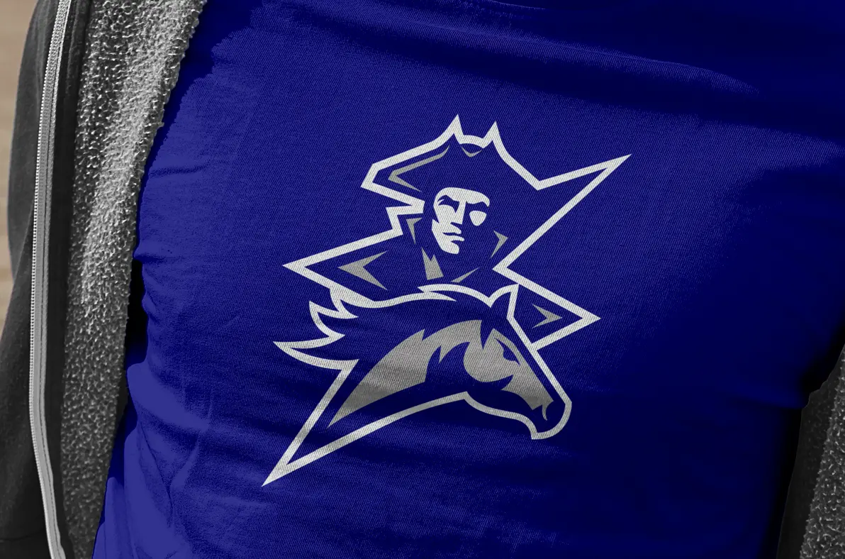
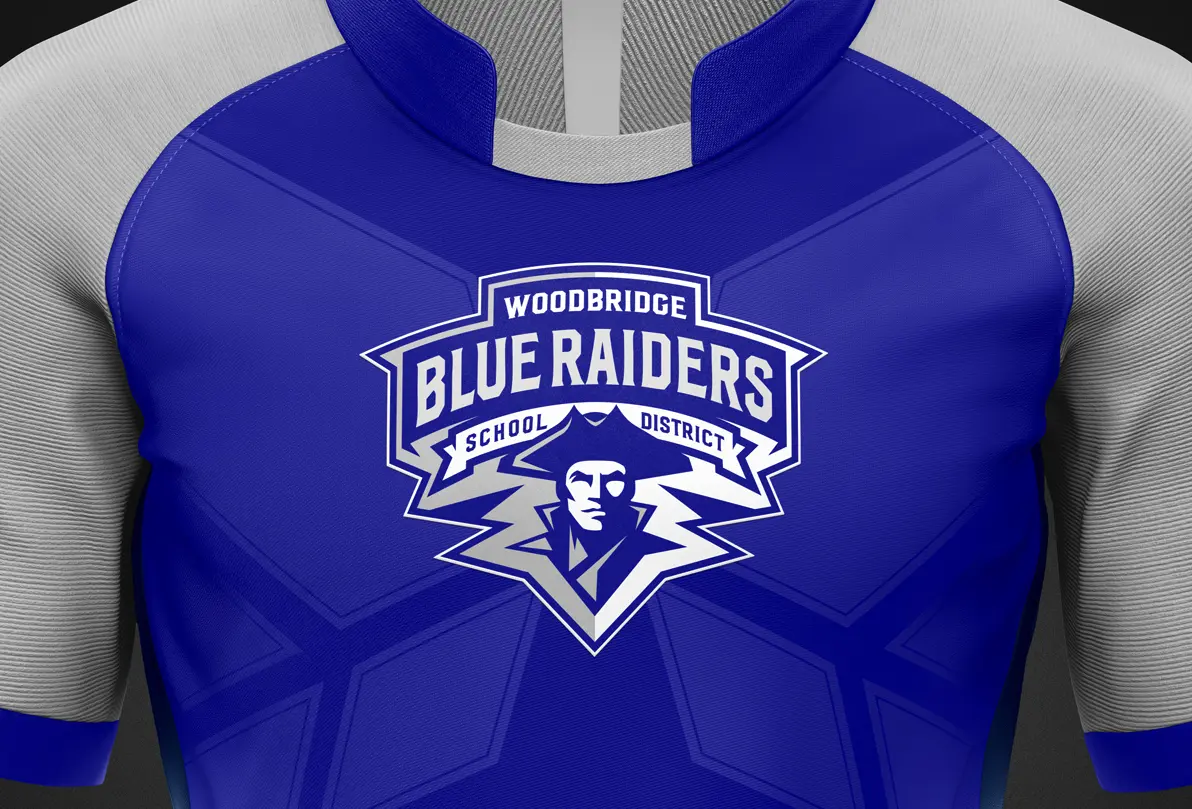
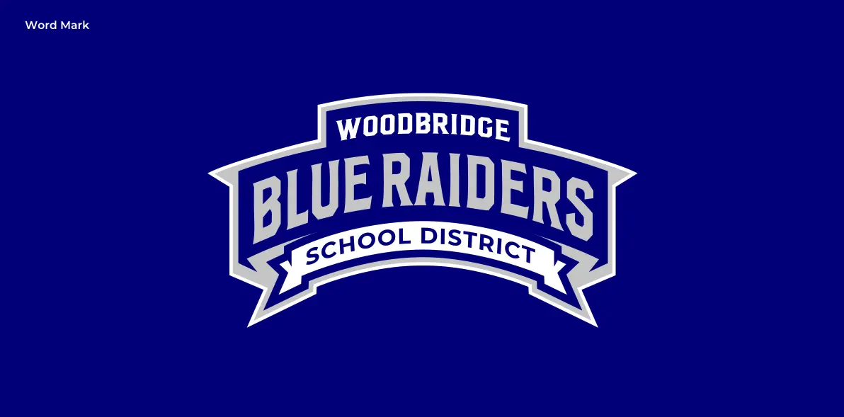
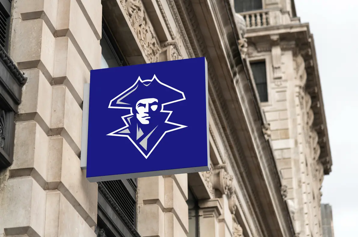
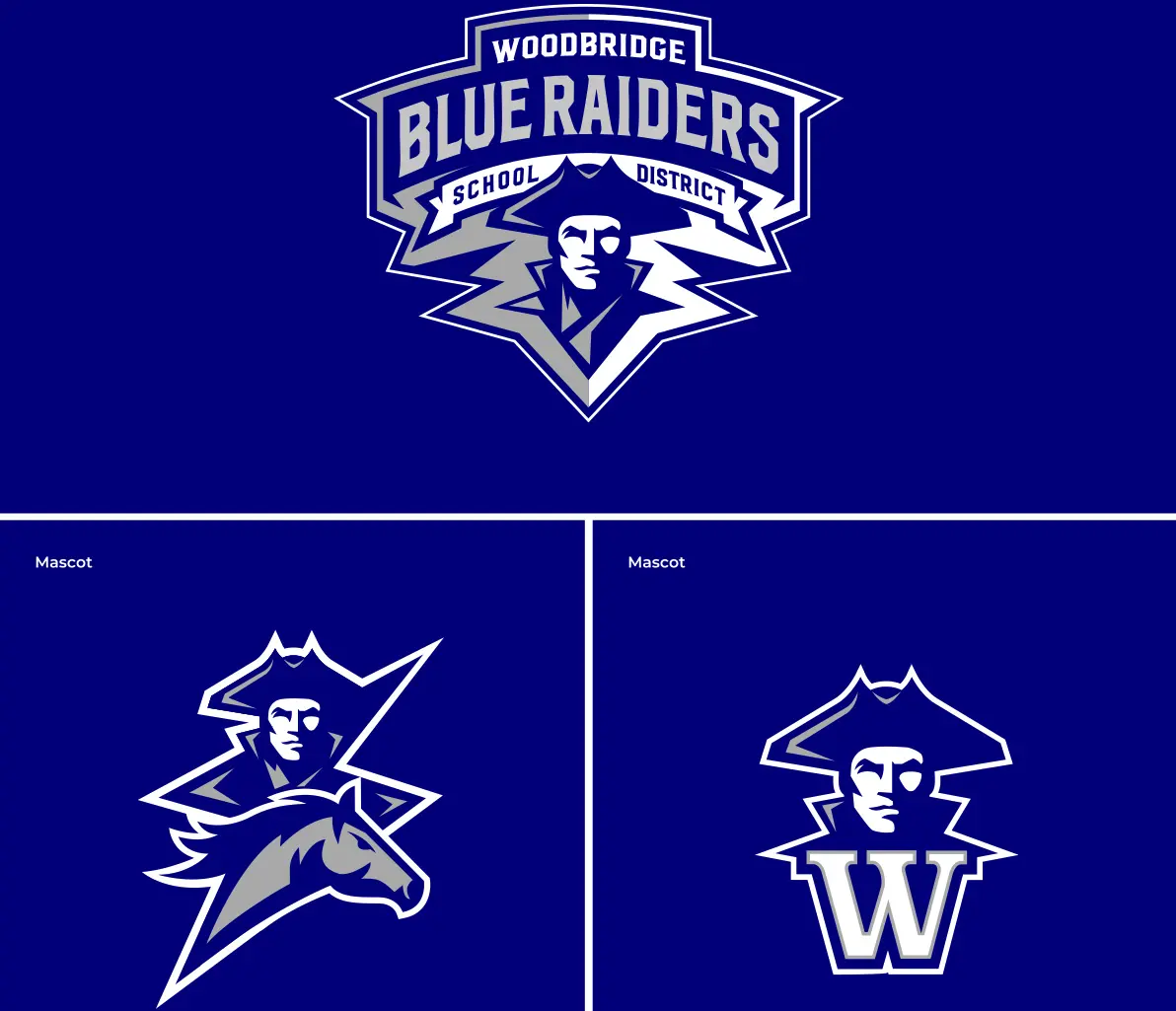
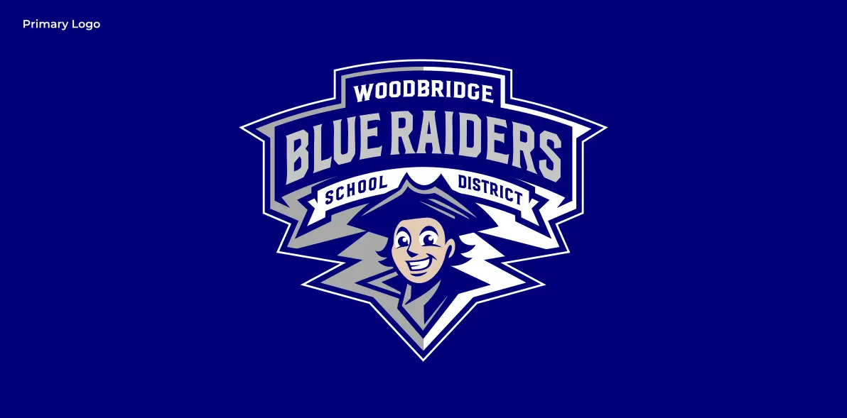
The Blue Raider crest features a bold, geometric character rendered with confident expression and lightning-frame detailing that references the heritage of both legacy mascots. The primary mark pairs the Raider character with a horse element in a unified lockup, printed on royal performance fabric with bold slab-serif “WOODBRIDGE BLUE RAIDERS” lettering. A standalone Raider head provides a simplified mark for helmets, caps, and small-format embroidery, while a full wordmark banner variation serves signage and digital header applications.
The identity system was deployed across six primary touchpoints:
- Athletic uniforms: Primary crest on performance jerseys with high-contrast outlines for gym-distance legibility
- Campus signage: Standalone Raider head on exterior signs and wayfinding applications for all four campuses
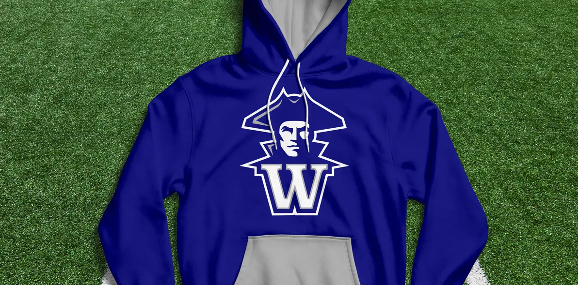
- Spirit wear: Royal blue tees, hoodies, and accessories featuring the unified Raider-horse lockup
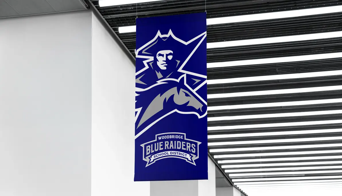
- Environmental graphics: Indoor hanging banners combining the full lockup with the district wordmark
- Brand guidelines: 40-page vendor document with color values, one-color versions, minimum sizes, and embroidery specifications
- Administrative materials: Wordmark banner treatment for letterhead, digital headers, and district communications
Results
The Blue Raider identity transformed a fragmented four-campus district into a unified system with one clear visual identity. All campuses now use the same brand, eliminating years of logo confusion and vendor miscommunication. The community responded positively, with strong approval from both parents and staff in district surveys. Spirit wear revenue increased dramatically in the first year as families finally had a single, high-quality brand to support. Athletic programs now present a cohesive front at every competition, and the 40-page guidelines document ensures that future vendors and staff maintain brand consistency without needing to consult the design team. The Blue Raider proved that strategic brand architecture can honor legacy while creating genuine forward momentum for a newly consolidated district.
Frequently Asked Questions
Why create a new mascot instead of choosing the Mustang or Forester? Choosing one legacy mascot over the other would have alienated half the community. The Blue Raider was designed as a fresh symbol that incorporates heritage elements from both Bridgeville and Greenwood, giving everyone a new identity to rally behind together.
How does the elementary variant differ from the primary mark? The elementary version softens facial features and reduces stroke weights to feel approachable for younger students while maintaining the same color palette, proportions, and design DNA as the athletic mark. Both versions are unmistakably Blue Raider.
What do vendors receive to ensure consistent production? The 40-page brand guidelines document includes vector files, Pantone and digital color values, one-color and reverse versions, minimum size specifications, and detailed embroidery and print production notes for frictionless manufacturing.
