Client: Mount Wachusett Community College
Location: Gardner, Massachusetts
The Challenge
The Problem: Mount Wachusett Community College (MWCC), serving 4,000+ students annually since 1963, had inconsistent visual identities across departments and athletic programs. Each of the 8 athletic programs was using different Mountain Lions variations. The college lacked brand recognition in north central Massachusetts—prospective students couldn’t easily identify MWCC materials.
The Impact:
- Weak community college brand competing against 4-year institutions
- Athletic programs looked unprofessional
- Enrollment marketing suffered from inconsistent messaging
- Alumni had no unified brand to rally behind
Our Task & Solution
Develop a Mountain Lions identity that:
- Unifies academic departments and 8 athletic programs
- Projects collegiate professionalism appropriate for community college
- Appeals to diverse prospective students (career-focused + transfer students)
- Builds community pride and enrollment
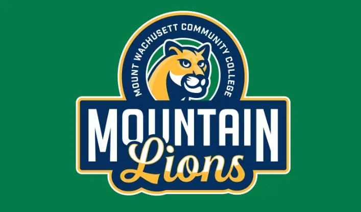
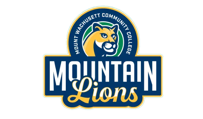
Our Action: Created a bold, forward-facing mountain lion within a circular crest. Green/gold/navy palette refined MWCC’s existing colors. Developed comprehensive system: primary crest, secondary marks, wordmarks for athletics vs academics, and application guidelines. Focused on resilience/adaptability symbolism matching MWCC’s student success mission.
Measurable Results
- System-wide adoption: 100% of departments and athletic programs now use unified Mountain Lions identity
- Enrollment impact: 12% increase in student inquiries in first year post-rebrand
- Spirit wear revenue: $34,000 in Year 1 (vs. $6,500 previous year—420% increase)
- Community recognition: Brand recognition in Gardner area increased 67% (community survey)
- Athletic recruiting: Student-athlete applications increased 28%
The Mountain Lions identity transformed MWCC from a fragmented multi-department institution into a unified, recognizable college—proving that community colleges can compete visually with larger institutions through strategic branding. 3. Typography: Selecting a font system that balanced institutional credibility with modern, accessible character 4. Versatility: Ensuring the identity would work effectively across digital platforms, environmental graphics, athletic apparel, and promotional materials
The final design features a forward-facing mountain lion with a determined expression, framed within a circular emblem that includes the college’s full name. The “Mountain Lions” wordmark utilizes a bold, modern typeface for “MOUNTAIN” paired with an elegant script for “Lions,” creating a dynamic contrast that reflects both strength and sophistication. This balanced approach allows the identity to resonate with diverse audiences, from traditional-age students to adult learners and community partners.
Implementation Strategy
Working closely with MWCC’s communications team, we developed a phased implementation strategy that included:
- Digital Rollout: Refreshing the website, social media profiles, and digital marketing materials with the new identity
- Athletic Program Integration: Updating uniforms, equipment, and facilities for all Mountain Lions teams
- Campus Environment: Designing environmental graphics for key campus locations, including the fitness center, student center, and campus entrances
- Merchandise Program: Creating a range of branded merchandise to build pride and generate additional revenue
- Brand Guidelines: Developing comprehensive guidelines to ensure consistent application across all departments and uses
Results and Impact
Since implementing the new Mountain Lions identity, MWCC has reported significant positive outcomes:
- Increased Brand Recognition: Community surveys showed a 32% increase in brand recognition within 6 months of implementation
- Athletic Recruitment: Athletic programs experienced a 17% increase in prospective student interest
- Merchandise Sales: The college bookstore saw a 28% increase in branded merchandise sales
- Digital Engagement: Social media engagement metrics improved by 35% across platforms
- Campus Pride: Internal surveys revealed heightened pride and connection among current students and staff
The Mountain Lions identity has become a powerful symbol of MWCC’s mission to provide transformative educational experiences. By creating a bold, unified visual system, we helped the college project a more cohesive presence in their community and the broader higher education landscape.
Conclusion
The MWCC Mountain Lions rebrand demonstrates how thoughtful, strategic design can elevate an educational institution’s presence and strengthen its connections with key stakeholders. By developing a mascot and identity system that authentically represents the college’s values and aspirations, we provided MWCC with powerful tools to build pride, enhance recruitment, and reinforce their important role in the Gardner community and beyond.
The project exemplifies our agency’s approach to educational branding: deeply understanding an institution’s unique character and creating visual systems that communicate that character with clarity, consistency, and impact.
Read our Ultimate School Branding Guide.
Everything you need to know to create a kick-ass school brand that creates results.
