
Client
Simpson University
Location
Redding, California (Cal Pac Conference, NAIA)
The Challenge
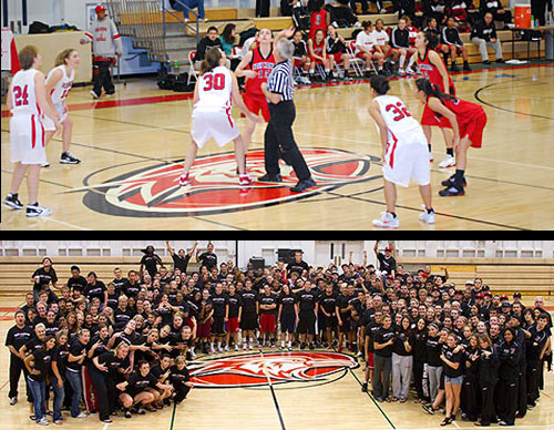
The Problem: Simpson University fields 11 athletic programs competing in the Cal Pac Conference, one of the most established NAIA conferences on the West Coast. Despite decades of competition since the 1950s, the university’s existing athletic branding lacked the fierce, competitive edge needed to stand out. The Hawks identity felt outdated and generic, failing to motivate student-athletes or project strength against Cal Pac rivals such as Bethany, Menlo, William Jessup, Holy Names, and Pacific Union. Recruiting materials did not carry the visual intensity that prospective athletes expect from a serious program, and merchandise sales reflected a student body that felt disconnected from the athletic brand.
The Impact: The outdated identity left Simpson looking like an afterthought in the conference. Coaches struggled to recruit top talent when competing programs presented stronger visual brands. Team morale suffered without a rallying symbol, and merchandise revenue remained flat.
Our Task
Create a fierce Hawks athletic identity that would:
- Inspire and motivate student-athletes across all 11 sports programs
- Project competitive strength within the Cal Pac Conference
- Modernize the Hawks brand while honoring Simpson’s heritage and values
- Appeal to prospective student-athletes during the recruiting process
- Work across uniforms, court and field graphics, digital media, and merchandise
Strategic Approach
Our research into NAIA athletic branding revealed that the most successful programs invest in aggressive, forward-facing mascot designs that communicate determination and competitive spirit at first glance. We studied the visual landscape of the Cal Pac Conference and identified that Simpson had an opportunity to lead the league in brand presence with a bold redesign. The university’s rich heritage and faith-based values required a mascot that projected fierceness without sacrificing the integrity of the institution.
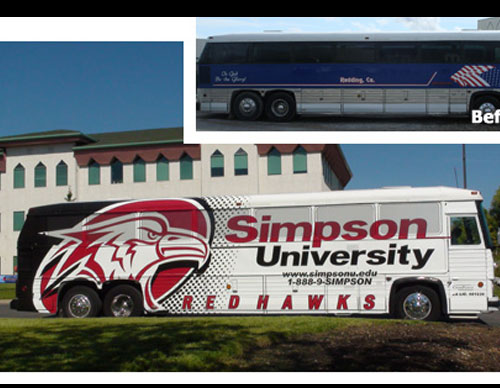
The hawk was selected because it represents vision, speed, endurance, and precision, which are traits that translate directly to athletic competition. The forward-facing orientation was a deliberate choice to project confidence and confrontation rather than the passive side-profile designs common in older collegiate brands. The color palette maintained Simpson’s traditional tones while introducing sharper contrasts and cleaner lines that reproduce crisply on uniforms, helmets, and digital screens.
Design Development
The Hawks mascot features a bold, aggressive hawk rendered in a forward-facing stance with sharp geometric planes that communicate intensity and focus. The primary athletic logo positions the hawk within a structured crest format that works at both large scale on gymnasium walls and small scale on sleeve patches. The design emphasizes powerful beak detailing, piercing eyes, and layered feather textures that create depth without sacrificing reproduction quality.
The identity system was deployed across five primary touchpoints:
- Athletic uniforms: Primary crest and sport-specific variations for all 11 programs
- Court and field graphics: Large-format hawk mark for center court, end zones, and scoreboards
- Recruiting materials: Bold Hawks branding on prospective student-athlete packets and digital presentations
- Merchandise: Performance apparel, headwear, and accessories for students, athletes, and alumni
- Digital presence: Website athletics section, social media templates, and streaming overlays
Results
The Hawks identity energized Simpson University’s entire athletic department. Coaches reported improved team morale and pride as athletes rallied behind the fierce new mascot. Student-athlete recruitment saw a significant increase as the updated brand competed visually with the conference’s top programs. Merchandise adoption grew substantially as students and alumni embraced the new Hawks gear. The design became a portfolio showcase piece, with other colleges, including Chadron State, approaching us after seeing Simpson’s transformation. The Hawks rebrand proved that strategic mascot design directly impacts athletic culture, recruitment appeal, and competitive spirit at the collegiate level.
Frequently Asked Questions
Why a forward-facing hawk instead of a side-profile design? Forward-facing mascots project confidence and confrontation, which are essential qualities for an athletic brand competing for attention in a crowded conference. The direct eye contact creates an immediate emotional response that passive profile designs cannot achieve.
How does one mascot work across 11 different sports? The system includes a primary crest, standalone hawk head, and sport-specific wordmark variations that maintain brand consistency while allowing each program to feel distinct. Vector construction ensures clean reproduction from basketball courts to golf polos.
Can a mascot redesign really impact recruiting? Absolutely. Prospective student-athletes evaluate programs visually before they ever visit campus. A strong athletic brand signals that the institution takes its programs seriously, which directly influences a recruit’s perception of program quality and investment.