Client: St. Matthew Catholic School
Location: San Antonio, Texas
Project: Traditional Crest Design & Identity System
St. Matthew Catholic School has been serving the San Antonio community since 1931, building a legacy of faith-based education and academic excellence. As part of the Archdiocese of San Antonio, the school provides a comprehensive educational experience that integrates Catholic values with rigorous academics for students from pre-kindergarten through eighth grade.
Like many established Catholic schools, St. Matthew had been using various versions of their visual identity across different applications, creating inconsistency in their communications and diluting brand recognition. The existing crest contained meaningful religious and educational symbolism but lacked the refinement and clarity needed for contemporary applications. As the school approached a significant milestone anniversary, leadership recognized the opportunity to refresh their visual identity while honoring their rich history and Catholic tradition.
Through thoughtful collaboration with school administration, parish leadership, and the Archdiocese, we established several key objectives for the project:
- Preserve and enhance the essential symbolism of St. Matthew’s Catholic identity
- Create a refined crest that honors tradition while functioning effectively in modern applications
- Develop a consistent visual identity system that unifies all school communications
- Establish brand standards that can be consistently applied by faculty and staff
- Design applications that appropriately represent both the school’s religious foundation and academic excellence
- Create a visual system versatile enough to serve various age groups within the K-8 environment
Strategic Approach
Our research phase included studying Catholic educational symbolism, reviewing the specific history of St. Matthew, and understanding the school’s position within the Archdiocese of San Antonio. We conducted interviews with long-serving faculty, alumni, and parish leadership to ensure we fully understood the meaningful elements that needed preservation.
The Latin motto “Ave Crux Spes Unica” (“Hail to the Cross, Our Only Hope”) emerged as a central element of the school’s identity—a phrase rich with theological significance that connects to the school’s foundational values. This motto, along with the established date of 1931, provided important anchors for the design, creating continuity between past and present.
We approached the design process with reverence for Catholic traditions and symbolism, recognizing that the crest would need to function not just as a school logo but as a sacred emblem representing faith, education, and community heritage.
Design Development
Crest Design
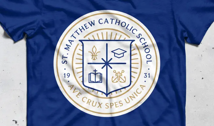
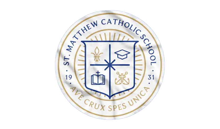
The refined St. Matthew crest features several deliberate symbolic elements, each selected for both their theological significance and visual clarity:
Shield Structure
- The traditional shield is divided into four quadrants, representing different aspects of the school’s mission
- A simplified outline improves reproduction while maintaining heraldic tradition
- The circular format creates a sense of unity and completeness
Symbolic Elements
- Upper Left: The fleur-de-lis symbolizes the Holy Trinity and connects to the school’s heritage
- Upper Right: The graduation cap represents academic excellence and educational achievement
- Lower Left: The open book signifies knowledge, Scripture, and the pursuit of truth
- Lower Right: A symbolic representation of faith, community, and service
Color System
- Navy Blue: Represents truth, loyalty, and devotion—core values in Catholic education
- Gold: Symbolizes excellence, dignity, and enlightenment
- White: Reflects purity, faith, and innocence
Typography & Text Elements
- “ST. MATTHEW CATHOLIC SCHOOL” in traditional serif letterforms encircling the crest
- “AVE CRUX SPES UNICA” motto placed prominently to emphasize the school’s spiritual foundation
- “19 31” marking the founding date, establishing institutional legacy
Radiating Lines
- Subtle rays emanating from behind the shield suggest enlightenment and divine guidance
- These elements add visual interest while connecting to religious symbolism of light and truth
Identity System Elements
Building on the crest design, we developed a comprehensive identity system including:
Primary Identity Suite
- Main crest for formal applications
- Simplified versions for smaller applications
- Lockups with full school name for various contexts
- Standalone wordmark for text-only applications
Supporting Visual Language
- Secondary color palette complementing the primary navy and gold
- Typography system featuring both traditional serif and contemporary sans-serif options
- Photography style guidelines emphasizing both faith-based and academic settings
- Pattern and texture elements derived from architectural features of the school and parish
Application Systems
- Academic materials and communications
- Liturgical and religious program applications
- Athletic program adaptations
- Development and advancement collateral
- Digital expression guidelines
Design Considerations
Several key considerations guided our design decisions:
Sacred vs. Secular Applications We developed guidelines for appropriate use of the crest in religious contexts versus everyday communications, ensuring respectful application across various materials.
Archdiocese Alignment The design system was created to function both as a distinct identity for St. Matthew while also harmonizing with broader Archdiocese of San Antonio visual standards.
Multi-Age Appropriateness Applications were developed with consideration for the K-8 environment, with variations that work appropriately for younger children through pre-teen students.
Reproduction Requirements Given the varied reproduction contexts in school environments—from digital to embroidery to economical printing—the crest was designed to maintain integrity across all applications.
Cultural Context San Antonio’s unique cultural heritage and the school’s specific community demographics influenced certain design decisions, creating a system that resonates with the local Catholic community.
The resulting identity system provides St. Matthew Catholic School with a refined visual presence that honors their rich tradition while functioning effectively across contemporary applications. The crest serves as both a practical school identifier and a meaningful symbol of the institution’s Catholic mission and educational excellence.
Read our comprehensive school branding guide.
Everything you need to know to create a kick-ass school brand that creates results.


