Client: Reach for the Stars
Location: Whittier, California
Project: Aspirational Brand Identity System
Background: Reach for the Stars Elementary in Whittier City School District needed a visual identity embodying their aspirational philosophy of empowerment and academic excellence.
Our Task: Create a dynamic, aspirational identity visualizing the “reach for the stars” concept that inspires students while providing district consistency.
Our Action: Designed geometric star crest with dynamic swoosh and district band, vibrant teal/purple palette appealing to elementary students and families.
Outcome: Aspirational identity deployed campus-wide. Visual language communicates ambition and possibility while maintaining clear district affiliation.
Strategic Approach
Our research revealed key insights that guided our design direction:
- Aspirational messaging resonates strongly with both students and parents, providing motivational touchpoints throughout the educational experience.
- Contemporary elementary school branding increasingly balances child-friendly appeal with sophisticated design elements that avoid appearing overly juvenile.
- Dynamic, swoosh-like elements can effectively communicate concepts of movement, progress, and reaching upward – directly connecting to the school’s name and philosophy.
- Distinctive color combinations play a crucial role in creating memorable identity systems for elementary students, who often identify their school primarily by color before other visual elements.
These insights informed our decision to create a dynamic, star-focused identity with a contemporary color palette that would stand out within the district while embodying the school’s forward-looking educational approach.
Design Development
Core Identity Elements
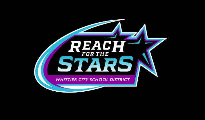
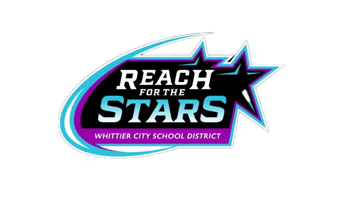
The Reach for the Stars identity features several strategic design components:
- Star Motif: A bold, geometric star creates immediate visual connection to the school name while symbolizing achievement, guidance, and aspiration.
- Dynamic Swoosh: A fluid, upward-moving element suggests motion, progress, and the literal concept of “reaching,” creating visual energy that appeals to young students.
- Typography System: “REACH FOR THE” appears in confident uppercase, while “STARS” receives greater prominence with larger scale and distinctive treatment, establishing clear visual hierarchy.
- Color Palette: The vibrant combination of teal, purple, and white creates a distinctive, contemporary presence that stands out in the educational landscape while appealing to elementary students.
- District Integration: “WHITTIER CITY SCHOOL DISTRICT” maintains clear presence within a containing band, establishing appropriate district affiliation while preserving the school’s unique identity.
Design System Applications
The identity system extends beyond the core mark to include:
Simplified Applications
- Reduced versions for smaller applications
- Star-only icon for symbol-focused contexts
- Word mark variations for text-only needs
Supporting Visual Elements
- Star pattern systems for backgrounds and supporting graphics
- Gradient applications for digital environments
- Typography hierarchy for consistent communications
- Color usage guidelines across various applications
Practical Education Applications
- Student recognition materials
- Classroom identification
- Spirit wear and community applications
- Digital presence and communications
Elementary-Specific Considerations
Several specialized factors guided our design decisions:
Aspirational Yet Accessible The system balances ambitious messaging with approachable presentation, creating inspiration without intimidation for young learners.
Visual Recognition All elements were designed for immediate recognition by elementary students, with distinctive color and shape serving as primary identification factors.
Dual Audience Appeal The contemporary styling appeals to students while projecting educational credibility to parents and community stakeholders.
Practicality Within Educational Settings The system addresses practical reproduction constraints within school environments while maintaining visual impact.
The resulting identity provides Reach for the Stars with a distinctive, inspirational visual presence that embodies their educational philosophy while creating memorable recognition among students, parents, and the broader Whittier community.
Read our complete school branding guide.
Everything you need to know to create a kick-ass school brand that creates results.
