Client: Harmony Public Schools
Location: Houston, Texas (Multi-campus charter network)
Challenge & Solution
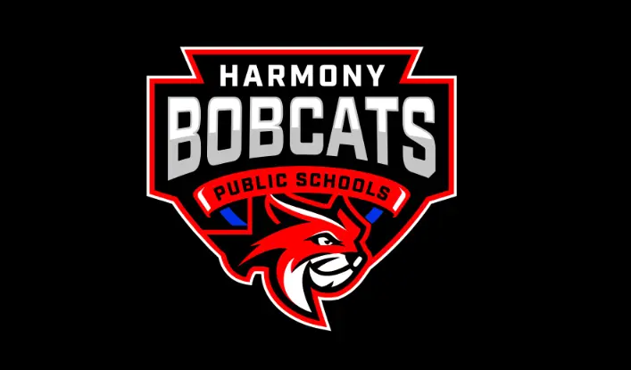
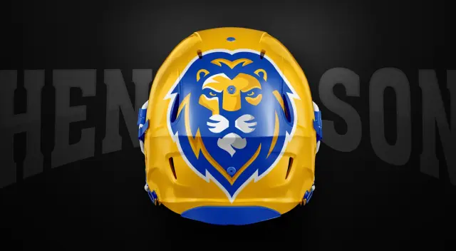
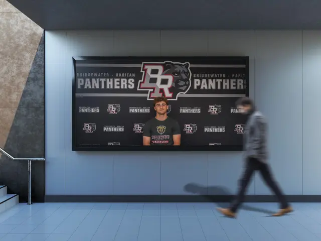
Problem: Harmony Public Schools (Texas charter network) needed unified identity across multiple campuses while maintaining STEM-focused positioning. Solution: Bobcats network shield system—master crest with campus adaptation framework. Result: Cohesive multi-campus charter identity supporting growth and educational excellence positioning.
- Educational specialization with broad appeal
- Institutional credibility with innovative positioning
- Local community connection with network-wide recognition
- STEM-focused educational brands are most effective when they:
- Express technology and innovation through contemporary design approaches
- Reference scientific concepts without becoming overly technical or abstract
- Maintain accessibility while projecting academic sophistication
- Create visual connections to college and career readiness
- Charter networks with multiple campuses require carefully structured identity architecture that:
- Clearly establishes hierarchy between network and campus identities
- Creates consistent recognition while allowing appropriate differentiation
- Facilitates efficient implementation across diverse applications
- Accommodates ongoing expansion with minimal disruption
These insights guided our development of a system that would unify Harmony’s visual presence while supporting their specialized educational model and multi-campus structure.
Design Development
Core Identity System
The Harmony Public Schools identity features several strategic components:
- Network Masterbrand: A distinctive primary mark establishes immediate recognition and communicates core network values, creating a unified foundation across all applications.
- STEM Visual Language: Design elements reference scientific and mathematical concepts through structured geometry, technology-inspired forms, and systematic organization—creating authentic connections to curriculum.
- Flexible Color Architecture: A sophisticated color system provides network consistency while allowing campus differentiation through controlled palette variations.
- Typography Framework: A carefully selected type system balances technological precision with approachable communication, supporting both academic and community-facing applications.
- System Scalability: All elements are designed for efficient implementation across diverse contexts and materials, acknowledging the practical realities of a growing charter network.
Multi-Campus Applications
The identity architecture extends to support Harmony’s organizational structure:
Network-Level Applications
- Corporate communications and reporting
- Policy and governance materials
- Website and digital ecosystem
- Development and advancement initiatives
Campus-Level Integration
- Individual school identification
- Local community engagement
- Campus environments and signage
- Student recruitment materials
Program-Specific Extensions
- STEM curriculum materials
- College readiness initiatives
- Leadership development programs
- Extracurricular and competition applications
Charter Network Considerations
Several specialized factors influenced our design decisions:
Marketplace Differentiation
The system creates clear visual distinction from both traditional public schools and competing charter networks, supporting Harmony’s market positioning and enrollment goals.
Stakeholder Diversity
Visual elements address the needs of diverse stakeholders including students, parents, educators, board members, donors, and regulatory authorities—each requiring specific communication considerations.
Implementation Efficiency
Practical constraints of a multi-campus network were addressed through streamlined guidelines, templated applications, and efficient production considerations.
Growth Accommodation
The system provides flexible frameworks for incorporating new campuses and programs, ensuring brand consistency through ongoing network expansion.
The resulting identity system provides Harmony Public Schools with a unified visual presence that effectively communicates their STEM-focused educational approach while creating practical solutions for their multi-campus charter network structure.
Read our Ultimate School Branding Guide.
Everything you need to know to create a kick-ass school brand that creates results.
