Client: Daniel Phelan Language Academy
Location: Whittier, California
Project: Bilingual Education Brand Identity
Background: Daniel Phelan Language Academy, a Whittier City School District elementary focused on bilingual education, lacked identity communicating language emphasis and cultural enrichment.
Our Task: Create visual identity authentically representing bilingual mission while engaging elementary students and diverse community stakeholders.
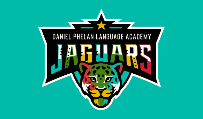
Our Action: Designed multicolor Jaguars crest symbolizing cross-cultural learning inside star-topped shield, vibrant typography with language-inspired cuts for K-5.
Outcome: Bilingual identity deployed campus-wide. Brand functions across multiple languages while establishing clear differentiation within Whittier district for families seeking language-focused education.
Strategic Approach
Our research revealed important insights about effective language academy branding:
- Successful bilingual education identities balance:
- Cultural specificity with inclusivity across diverse backgrounds
- Educational substance with engaging presentation for young learners
- Academic language learning with cultural appreciation
- Traditional educational cues with global perspective
- Visual systems for language academies are most effective when they:
- Function seamlessly across multiple languages without modification
- Incorporate subtle cultural references without relying on stereotypes
- Create connections to global citizenship and cross-cultural communication
- Support both language instruction and broader educational goals
- Typography and verbal elements require special consideration, with effective systems:
- Accommodating multiple character sets and writing systems
- Maintaining consistent brand presence across language variations
- Addressing multilingual naming conventions and translations
- Supporting both primary program languages and additional linguistic diversity
These insights guided our development of an identity system that would authentically represent Phelan’s bilingual educational approach while engaging their diverse elementary community.
Design Development
Core Identity Elements
The Daniel Phelan Language Academy identity features several strategic components:
- Cross-Cultural Symbolism: Visual elements reference global communication and language exchange through universally recognized symbols that transcend specific cultural boundaries.
- Typographic Versatility: A carefully selected type system ensures consistent presentation across multiple languages and writing systems, maintaining brand integrity regardless of linguistic context.
- Color Language: A sophisticated palette draws subtle inspiration from diverse cultural color associations while creating a distinctive presence that stands apart from conventional elementary school branding.
- Inclusive Imagery: Supporting visual elements celebrate cultural diversity while avoiding stereotypical representations, creating authentic connections to the global perspective central to Phelan’s educational approach.
- Bilingual Structure: The overall system provides frameworks that accommodate dual-language presentation in balanced, respectful ways—reflecting the equal value placed on both program languages.
Language-Focused Applications
The identity extends to support various contexts within Phelan’s specialized curriculum:
Instructional Materials
- Bilingual classroom resources
- Language learning environments
- Cultural education displays
- Multilingual signage and wayfinding
Community Engagement
- Multicultural event promotions
- Diverse family communications
- Community partnership materials
- Cultural celebration resources
Student Recognition
- Language achievement acknowledgment
- Cross-cultural project identification
- Global citizenship initiatives
- Multilingual student work displays
Specialized Considerations
Several key factors influenced our design decisions:
Linguistic Inclusivity
The system functions effectively across Phelan’s primary program languages while accommodating the broader linguistic diversity within the school community.
Cultural Sensitivity
Visual elements celebrate cultural differences while avoiding appropriation or stereotyping, with careful consideration of how symbols and references might be perceived across diverse backgrounds.
Elementary Accessibility
While sophisticated in concept, all elements maintain accessibility and engagement for elementary-aged students, with applications adjusted for developmental differences between early and upper elementary.
District Integration
The identity establishes Phelan’s distinctive focus while maintaining appropriate connection to the Whittier City School District, acknowledging its role within the broader educational community.
The resulting identity system provides Daniel Phelan Language Academy with a distinctive visual presence that authentically communicates their bilingual educational approach while celebrating cultural diversity and global perspective.
Read our complete school branding guide.
Everything you need to know to create a kick-ass school brand that creates results.
