Client: SWPREP New Directions Knights
Location: San Antonio, Texas
Project: Knight Mascot & Brand Identity
School Type: Charter School
School District: Southwest Preparatory School District
SWPREP New Directions, located in Seguin, Texas, is a forward-thinking charter school focused on innovative education strategies and student empowerment. As part of the Southwest Preparatory School District, SWPREP New Directions aims to equip students with both academic knowledge and the confidence to forge their own paths in an ever-changing world.
The school engaged our agency to develop a compelling brand identity centered around a Knights mascot that would reflect their innovative approach to education while resonating with students, parents, and the broader community. They needed a visual identity that would communicate strength, honor, and a progressive educational philosophy.
Through strategic planning sessions with school leadership and stakeholder representatives, we established the following objectives for the SWPREP New Directions Knights brand identity:
- Create a modern, dynamic Knight mascot that symbolizes protection, honor, and forward movement
- Develop a bold visual identity system that conveys innovation while maintaining educational credibility
- Design a versatile brand that works effectively across digital and physical applications
- Establish a vibrant blue and silver color palette that creates distinctive recognition
- Build a cohesive identity that instills pride and unifies the school community
- Create a system that communicates the school’s dual commitment to tradition and innovation
Strategic Approach
Our research into educational branding for innovation-focused institutions revealed the importance of balancing forward-thinking design with established educational symbolism to maintain credibility while projecting progress.
The Knight was selected as the ideal mascot for several compelling strategic reasons:
- Knights represent both tradition (honor, valor) and progress (questing, forward movement)
- The armored knight symbolizes protection and preparation – key aspects of educational development
- The combination of shield and helmet creates strong, immediately recognizable silhouettes
- The knight concept offers rich symbolic territory for “new directions” in educational journeys
- The medieval warrior theme appeals across age ranges while maintaining institutional gravitas
The color palette of royal blue, silver, and white was strategically chosen to:
- Project trust, stability, and intelligence through the dominant blue tones
- Create a clean, technological feel with the silver accents
- Provide sufficient contrast for strong visibility across applications
- Establish a contemporary aesthetic that feels both innovative and timeless
- Differentiate from other schools in the district while maintaining system cohesion
Design Development
Mascot Creation
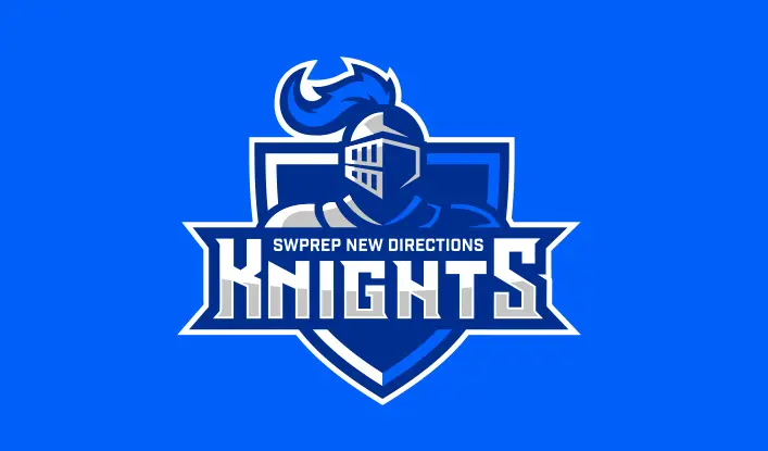
The Knights mascot was crafted with careful attention to both symbolic meaning and contemporary design principles:
- The profile knight helmet with distinctive horns creates an immediately recognizable silhouette
- The stylized, angular treatment conveys strength while maintaining a modern aesthetic
- The integration of the helmet into the shield creates a cohesive symbolic unit
- The simplified forms ensure clarity at various reproduction sizes
- The balanced proportions work effectively across different applications
The final design features a knight helmet centered in a shield-shaped emblem, with the “KNIGHTS” wordmark boldly positioned below. The “SWPREP NEW DIRECTIONS” identifier anchors the top of the composition, creating a balanced hierarchical layout with strong visual impact.
Brand Architecture
The identity system was developed with comprehensive applications in mind:
Primary Identity Elements
- Main logo featuring the knight helmet mascot with complete typography
- Shield-only version for simplified applications
- Helmet standalone element for social media and spirit applications
- Wordmark variations for administrative and academic contexts
Color Implementation Strategy
- Primary application: full-color version on blue backgrounds for maximum impact
- Secondary application: reversed version on white backgrounds for formal contexts
- Single-color versions in white, blue, or black for cost-effective reproduction
- Special applications in metallic silver for premium materials and recognition contexts
Typography System
- Primary font: angular, bold typeface for “KNIGHTS” to convey strength and precision
- Secondary font: structured sans-serif for “SWPREP NEW DIRECTIONS” to communicate clarity
- Supporting typeface: clean, modern font family for extended communications
Supporting Graphic Elements
- Shield framework as a container for specialized content and departmental identifiers
- Angular pattern system derived from the helmet design for background applications
- Simplified knight silhouettes for spirit contexts and student materials
- Custom iconography system that blends medieval and modern technological elements
- Visual vocabulary of pathways and directions that support the “New Directions” naming
The comprehensive design system ensures that the Knights identity functions effectively across all school-related contexts while maintaining consistent brand recognition. The versatile components allow for creative applications in both traditional and digital environments while preserving the core identity elements that define the SWPREP New Directions Knights brand.
Read our Ultimate School Branding Guide.
Everything you need to know to create a kick-ass school brand that creates results.