Client: SWPREP Northwest Royals
Location: San Antonio, Texas
Project: Royal Lion Mascot & Brand Identity
School Type: Charter School
School District: Southwest Preparatory School District
SWPREP Northwest, located in San Antonio, Texas, is a charter school dedicated to emphasizing individualized learning and leadership development. As part of the Southwest Preparatory School District, SWPREP Northwest strives to cultivate students who are not only academically proficient but also prepared to lead with confidence and character.
The school sought our expertise to develop a compelling brand identity centered around a Royals mascot that would reflect their commitment to educational excellence and leadership cultivation. The identity needed to serve as a rallying point for school pride while establishing a distinguished presence in San Antonio’s educational landscape.
Through comprehensive discussions with the school administration and key stakeholders, we established these core objectives for the SWPREP Northwest Royals brand identity:
- Create a majestic lion mascot that embodies leadership, excellence, and royal authority
- Develop a refined visual identity system that positions SWPREP Northwest as a premier educational institution
- Design a versatile brand that functions effectively across academic, administrative, and community contexts
- Establish a distinctive blue and gold color palette that inspires school pride and immediate recognition
- Build a cohesive identity system that unites students and faculty under a shared vision of excellence
- Create a brand that communicates the school’s values of leadership development and individual achievement
Strategic Approach
Our research into successful educational branding, particularly for charter schools focused on leadership development, revealed the importance of creating identities that balance aspirational qualities with approachable applications.
The lion was selected as the ideal representation of the Royals concept for several strategic reasons:
- Lions symbolize leadership, courage, and strength – qualities central to the school’s mission
- The combination of lion and crown creates immediate associations with royalty and excellence
- The lion’s recognizable silhouette offers versatile application opportunities across various media
- The “king of beasts” metaphor aligns perfectly with the Royals naming convention
- The forward-facing lion creates an immediate connection and sense of authority
The color palette of royal blue, gold, and white was strategically chosen to:
- Establish a classic royal aesthetic that reinforces the Royals naming
- Create high visibility and contrast across various applications
- Project confidence, reliability, and academic excellence
- Distinguish SWPREP Northwest within the district while maintaining system cohesion
- Provide versatile color combinations for different contexts and applications
Design Development
Mascot Creation
The Royals lion mascot was crafted with deliberate attention to both symbolic meaning and practical implementation:
- The forward-facing lion with crown creates direct engagement and authority
- The stylized mane adds distinctive character while maintaining clean reproduction at various sizes
- Geometric simplification ensures the design remains recognizable at small scales
- The balanced expression conveys confidence without appearing intimidating
- The integration within a shield framework references tradition and achievement
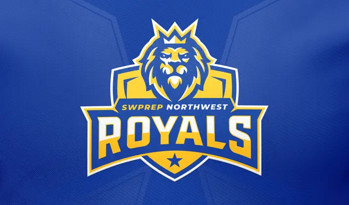
The final design features a crowned lion head centered in a shield-shaped emblem, with the “ROYALS” wordmark boldly positioned below. The “SWPREP NORTHWEST” identifier anchors the top of the composition, creating a balanced hierarchical layout with a star element adding a distinctive finishing touch.
Brand Architecture
The identity system was developed with comprehensive applications in mind:
Primary Identity Elements
- Main logo featuring the crowned lion mascot with complete typography
- Shield-only version for simplified applications
- Lion head standalone element for social media and spirit applications
- Wordmark variations for administrative and academic contexts
Color Implementation Strategy
- Primary application: full-color version on blue backgrounds for maximum impact
- Secondary application: reversed version on gold backgrounds for special contexts
- Single-color versions in white, blue, or black for cost-effective reproduction
- Special applications using metallic gold for premium materials and recognition contexts
Typography System
- Primary font: bold, structured typeface for “ROYALS” to convey strength and tradition
- Secondary font: refined sans-serif for “SWPREP NORTHWEST” to communicate academic excellence
- Supporting typeface: clear, accessible font family for extended communications
Supporting Graphic Elements
- Crown motif as a secondary symbol for leadership recognition
- Shield framework as a container for specialized content
- Star element representing achievement and excellence
- Pattern system derived from shield geometry for background applications
- Custom icon system for program and department identification
The design system ensures that the Royals identity maintains consistency while providing flexibility across all school-related applications. The system components allow for creative implementation while preserving the core brand elements that define the SWPREP Northwest Royals identity.
Read our Ultimate School Branding Guide.
Everything you need to know to create a kick-ass school brand that creates results.