Client: Neptune Elementary School
Location: St. Cloud, Florida
Project: Rocket & Space Theme Identity
School Type: Elementary School
School District: Osceola County School District

Through collaborative discussions with school administration, innovation-focused faculty members, parent representatives, and student input sessions, we established the following objectives for the Neptune Elementary School brand identity:
- Create an engaging, dynamic rocket/space-themed visual identity that connects to the “Neptune” name
- Develop a child-friendly brand system that makes innovation and exploration accessible and exciting
- Design a versatile identity that functions effectively across educational and community contexts
- Establish a vibrant blue color palette with cosmic accents that creates strong recognition
- Build a cohesive identity that inspires curiosity, imagination, and educational engagement
- Create a system that communicates the school’s innovative approach to elementary education
Strategic Approach
Our research into elementary school branding, particularly for institutions with innovation-focused missions, revealed the importance of creating identities that make abstract concepts like exploration and discovery tangible and exciting for young children. The visual system needed to capture imaginations while maintaining educational credibility and institutional trust.
The rocket and space theme was selected as the central identity concept for several strategic reasons:
- The rocket symbolizes forward movement, exploration, and reaching new heights – perfect metaphors for education
- The space theme creates an immediate connection to the “Neptune” planetary name
- The combination offers rich visual territory that naturally appeals to elementary-aged children
- The exploration concept aligns perfectly with the school’s innovative educational approach
- The theme provides endless educational connections across science, technology, and imagination
The color palette of bright cyan blue, navy blue, silver, and yellow accents was strategically chosen to:
- Create a vibrant, sky-blue presence that directly connects to the “Neptune” name
- Add cosmic depth through the contrasting navy space background
- Incorporate metallic silver for technological associations and rocket detailing
- Establish a distinctive presence that stands apart from other elementary schools
- Project both excitement and educational substance through balanced color application
Design Development
Identity Creation
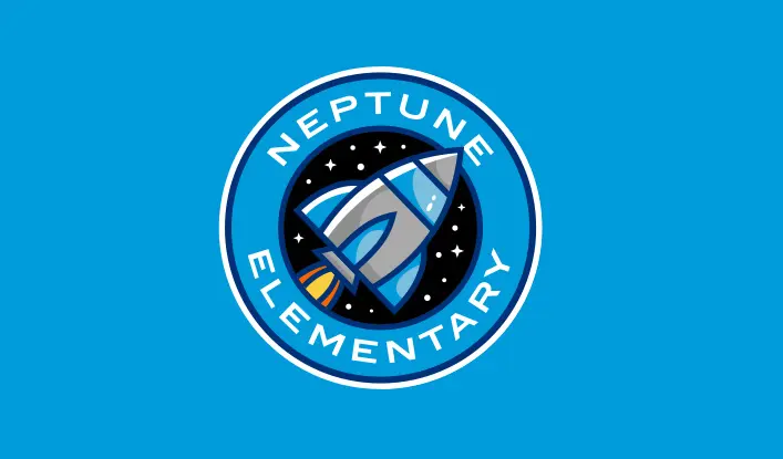
The Neptune Elementary space identity was developed with careful attention to both imaginative appeal and educational substance:
- The dynamic rocket creates an immediate focal point suggesting movement and progress
- The circular starfield background establishes cosmic context and visual interest
- The clean, simplified forms ensure recognition while engaging young imaginations
- The circular badge format provides a containing device that suggests both planets and unity
- The balanced composition respects educational purpose while sparking curiosity
The final design features a sleek silver rocket with blue and yellow accents positioned within a circular cosmic backdrop, with the “NEPTUNE” designation curving along the top of the badge and “ELEMENTARY” along the bottom. The starfield background creates depth and context, resulting in a balanced composition with strong visual impact and immediate appeal to elementary-aged children.
Read our Ultimate School Branding Guide.
Everything you need to know to create a kick-ass school brand that creates results.
