Client: Student Services – Osceola District Schools
Location: Kissimmee, Florida
Project: Student Support Visual Identity
Department Type: Educational Support Services
School District: Osceola County School District
Background: Student Services department provides wellness, counseling, psychological services, and social work but lacked distinctive visual identity differentiating their vital support role within the district.
Our Task: Create people-focused visual identity representing student support, diversity, and holistic development—distinct from school mascots or academic symbols.
Our Action: Designed human profile circle mark in compassionate purple/green palette, professional yet approachable system for support service contexts.
Outcome: Human-centered identity deployed across counseling, psychological services, social work programs. Brand balances institutional credibility with warmth and accessibility.
- Create a system that works cohesively across multiple student service programs
Strategic Approach
Our research into educational support services branding revealed the importance of creating identities that balance professional authority with approachability and compassion. Unlike academic departments or administrative offices, student support services require visual systems that communicate understanding, acceptance, and human connection.
The profile-based circular design was selected for several strategic reasons:
- Human profiles immediately communicate the people-focused nature of the services
- The circular format suggests completeness, continuity, and holistic support
- Multiple profiles represent diversity, inclusion, and the varied student population
- The circular border creates a containing, protective visual metaphor
- The simple, clean approach ensures clarity and recognition across applications
The color palette of purple and green was strategically chosen to:
- Project compassion and wisdom through the dominant purple tones
- Add balance and growth associations through the complementary green
- Create immediate visual distinction from other district departments
- Establish a professional yet approachable aesthetic
- Provide sufficient contrast for strong visibility across applications
Design Development
Identity Creation
The Student Services identity was developed with careful attention to both symbolic meaning and practical application:
- Simplified human profiles create immediate recognition of the human-centered services
- The alternating profiles represent diversity, inclusion, and supportive relationships
- The circular border creates a containing, protective framework
- The balanced composition suggests stability and support
- The clean, simplified approach ensures clarity across various applications
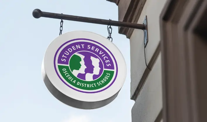
The final design features multiple human profiles arranged within a circular border, with the “STUDENT SERVICES” designation positioned along the top arc and “OSCEOLA DISTRICT SCHOOLS” along the bottom. The purple and green color distribution creates a balanced, harmonious composition with strong visual impact.
Brand Architecture
The identity system was developed with comprehensive applications in mind:
Primary Identity Elements
- Main circular logo featuring profiles with complete department designation
- Simplified version without text for compact applications
- Wordmark variations for administrative and formal contexts
- Program-specific variations for specialized service areas
Color Implementation Strategy
- Primary application: full-color version on white backgrounds for formal documents
- Secondary application: white/reversed version on purple backgrounds for signage
- Tertiary application: single-color purple version for economical reproduction
- Program-specific applications with designated accent colors for different service areas
Typography System
- Primary font: clean, rounded sans-serif for the department name to communicate accessibility
- Secondary font: professional, structured typeface for formal communications
- Supporting typeface: highly readable font family for informational materials and forms
Supporting Graphic Elements
- Expanded profile system for program-specific materials
- Circular motifs representing continuity of care and support
- Supportive graphic elements suggesting connection and relationships
- Iconography system for different service categories
- Photographic style guide emphasizing diverse student interactions and supportive moments
Program-Specific Applications
- Counseling Services: Purple dominant with counseling-specific iconography
- Psychological Services: Purple/blue accent variation with appropriate symbols
- Social Work Services: Purple/warm accent variation with community elements
- Special Needs Support: Purple/green dominant with accessibility symbols
The comprehensive design system ensures that the Student Services identity functions effectively across all department communications while maintaining consistent brand recognition. The versatile components allow for program-specific applications while preserving the core identity elements that define the Student Services brand within the Osceola District Schools system.
Read our complete school branding guide.
Everything you need to know to create a kick-ass school brand that creates results.
