Woodbridge School District Mascot Logo & Branding
Location
Woodbridge, DE
Services Rendered
- School Logo Design
- School Mascot Design
- Visual Identity
- Positioning Strategy
Deliverables
- Final Source Files
- Brand Style Guide
Woodbridge School District, located in the rural heart of Western Sussex County, Delaware, serves a tight-knit community spread across four campuses – two elementary schools, one middle school, and one high school. Over 50 years ago, the schools from Bridgeville and Greenwood consolidated to form this district. But while the district came together operationally, its visual identity remained fragmented.
Each campus used a different logo. There was no consistent mascot representation. No central symbol the community could rally around. That’s where we came in.


The Challenge
Woodbridge needed more than just a logo. They needed a unified brand identity – one that honored the district’s proud past and energized its bright future. Key considerations included:
-
Creating a central Blue Raider mascot that could represent all four campuses
-
Incorporating historical elements from Bridgeville’s Mighty Mustang and Greenwood’s Forester
-
Retaining the district’s blue, grey, and white color palette
-
Designing a softer variation suitable for the elementary schools
-
Embodying the district’s core values: Respect, Achievement, Integrity, Diversity, Excellence, Relationships, and Service
This wasn’t just about design—it was about identity, heritage, pride, and the future of a community.

Read our Ultimate School Branding Guide.
Everything you need to know to create a kick-ass school brand that creates results.

The Concept
We grounded the logo in three truths:
-
Unity Through Strength: The new logo had to reflect a unified school spirit and be versatile across all campuses and age groups.
-
Historical Homage: It needed subtle nods to the Mustang and Forester legacies.
-
Modern Impact: It had to feel modern, athletic, powerful—something that looked just as good on a gym wall as it did on a t-shirt.

The Design
At the core of the new logo stands the Blue Raider – a modern interpretation of a revolutionary-era figure. Sharp lines, bold contrast, and a powerful expression represent the district’s strength, resilience, and leadership. The hat and coat silhouette is stylized, making it feel timeless without being tied to a single historical period.
Surrounding the mascot is a custom-built crest with angular framing and lightning-inspired edges – symbolizing energy, forward momentum, and excellence. The typography is bold and confident, with “WOODBRIDGE” clearly sitting atop the mark, and “SCHOOL DISTRICT” anchored below the Raider in ribboned banners.
The use of silver-grey lightning strokes is a subtle reference to Greenwood’s Forester strength – raw, natural power. The overall stance and intensity reflect the fearless spirit of Bridgeville’s Mighty Mustang.
The final logo works at every scale – from gym banners to lapel pins – while giving Woodbridge a clean, powerful, and ownable identity.

The Color System
The color palette stayed true to the district’s roots:
-
Blue: Leadership, loyalty, and trust
-
Grey/Silver: Wisdom, dignity, and modernity
-
White: Clarity, integrity, and excellence
We crafted a strong contrast to ensure the logo pops across print, digital, and merchandise.

The Elementary Adaptation
For the elementary schools, we explored softer versions of the Raider—rounder facial features, simplified lines, and a gentler expression. The goal: keep the mascot recognizable but age-appropriate. This optional variation makes it easier to extend school pride to younger students without overwhelming them with intensity.

Outcome
The final logo was not just well-received—it sparked real pride across campuses. For the first time, students, teachers, alumni, and families have a shared symbol that reflects their collective identity. From uniforms to websites to murals, the new Blue Raider leads the charge with strength and unity.
Reflections
This wasn’t just another mascot design.
It was a story about merging legacies, honoring the past, and building a symbol of hope, pride, and excellence for the future. By anchoring the design in the district’s RAIDERS values—Respect, Achievement, Integrity, Diversity, Excellence, Relationships, and Service—we ensured the logo wasn’t just visual. It was deeply emotional.
Now, wherever you see the Blue Raider—you see Woodbridge.
Proud Past. Bright Future. The Place to Be.
More School Branding Case Studies
Frequently Asked Questions
Why did Woodbridge School District need a new logo?
The district had multiple logos in use across its campuses, which created confusion and a lack of brand consistency. The new logo unifies the district under a single, powerful identity that reflects its history, values, and future direction.
How does the new logo honor the legacy of Bridgeville and Greenwood?
The design subtly integrates the strength of Greenwood’s Forester through bold, angular strokes and the spirit of Bridgeville’s Mighty Mustang through the fierce, forward-facing stance. While the Blue Raider is the primary mascot, historical elements are woven into the design’s foundation.
What makes this logo usable across all school levels?
The main design is bold and athletic—ideal for middle and high school settings. A modified, softer version was also created for elementary schools, with gentler features to ensure younger students can still connect with the mascot without intimidation.
Can we see variations of the mascot design on different merchandise?
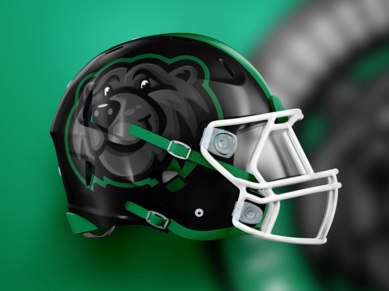
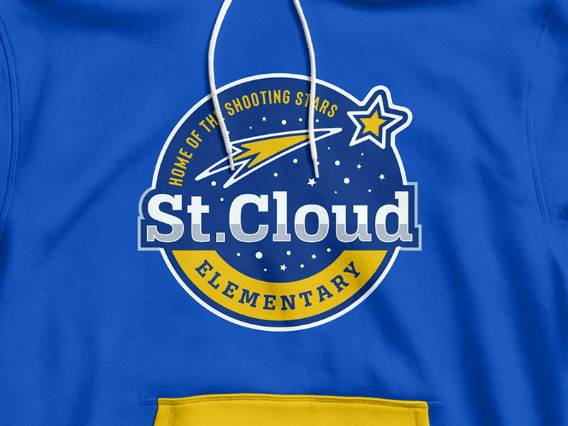
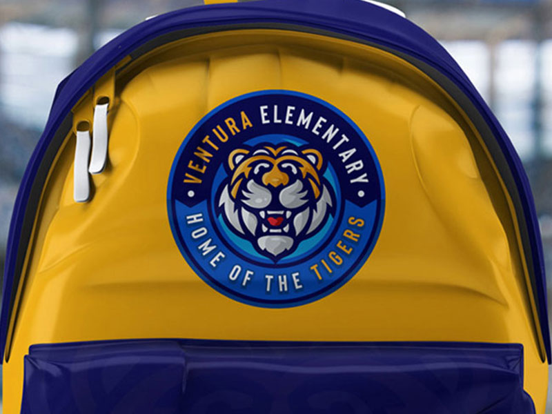
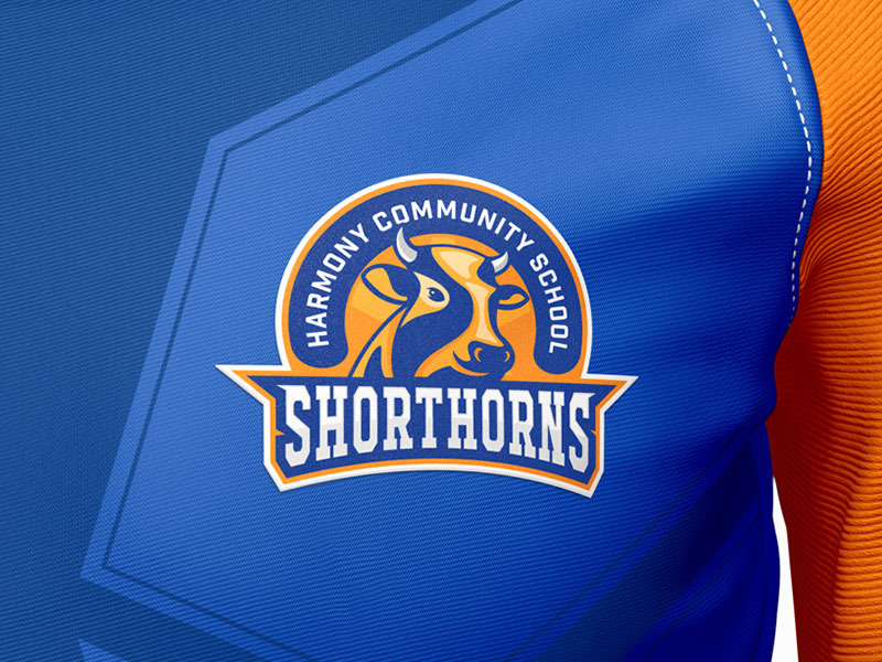
Yes, you can. We’ve created a range of merchandise mock-ups showcasing how the mascots look on everything from t-shirts and hoodies to water bottles and backpacks. This helps visualize the mascots in various applications.
How were the district’s core values incorporated into the design?
The logo represents more than just a mascot. It visually channels the RAIDERS values—Respect, Achievement, Integrity, Diversity, Excellence, Relationships, and Service—through symbolic design elements like the unifying crest, confident stance, and powerful expression.
What feedback has the school received about the new wolf mascot?
The response to our new wolf mascot has been overwhelmingly positive. Students, parents, and alumni appreciate the fresh, energetic representation of our school spirit. The mascot has already started to foster a renewed sense of community pride and connection, helping ease the transition from our previous mascot while honoring our school’s legacy and traditions.


